
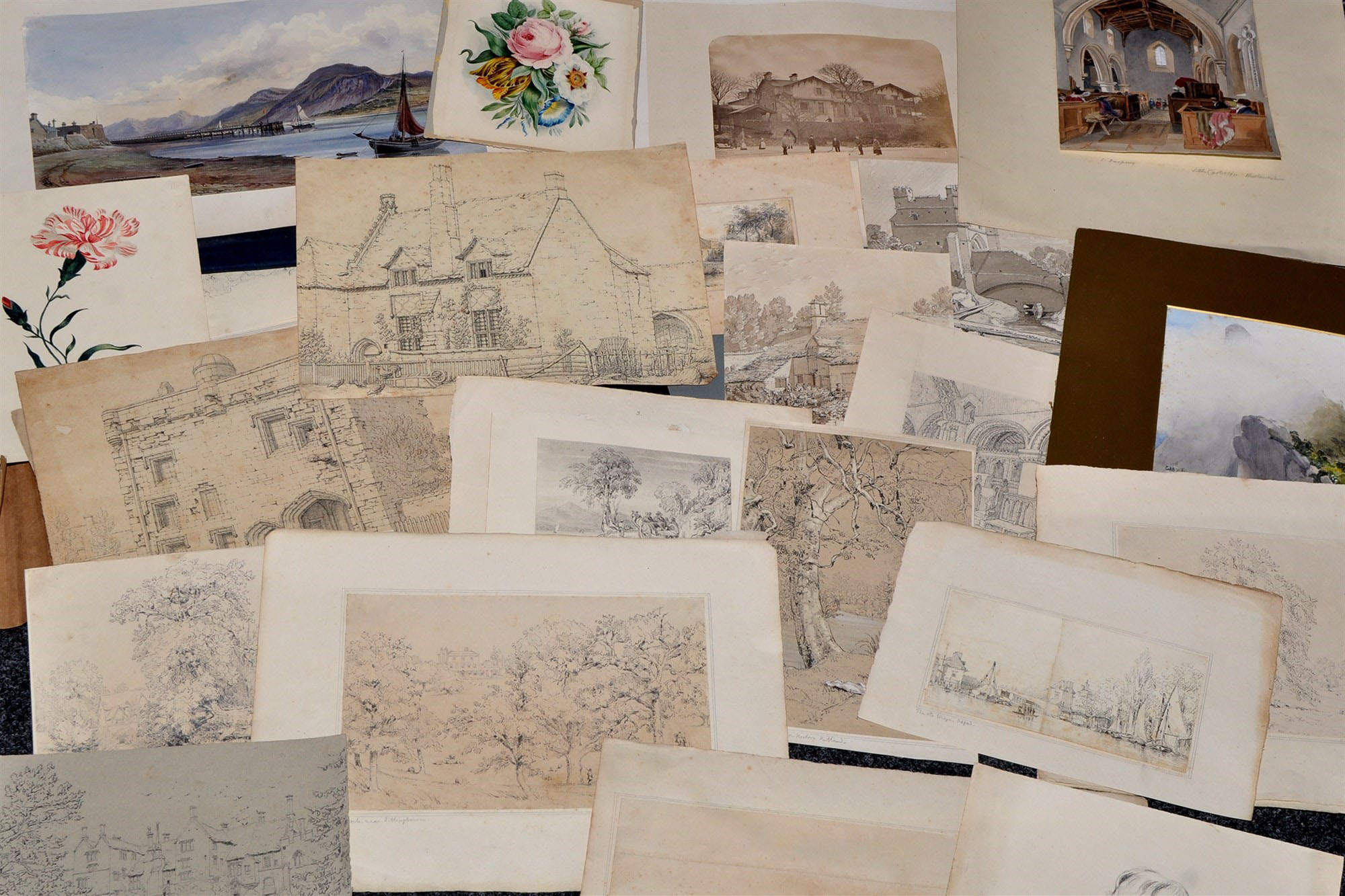
This article considers the twenty-fourth work of twenty-five bought at Anderson & Garland Ltd, Newcastle upon Tyne, 21 March 2017, lot 46 as Various Artists (British 19th Century) Sundry drawings and watercolours, mainly topographical and floral studies, including a grisaille “South Gate Lynn, Norfolk”, bearing the signature J.S. Cotman, various sizes, all unframed in a folio.
Here we look at the last of three flower drawings from a portfolio within the portfolio that once belonged to Sarah Parkin of Skirsgill, Cumbria. This drawing, however, is unique for being painted on silk. It also seems to have had some history even before Sarah Parkin was born.
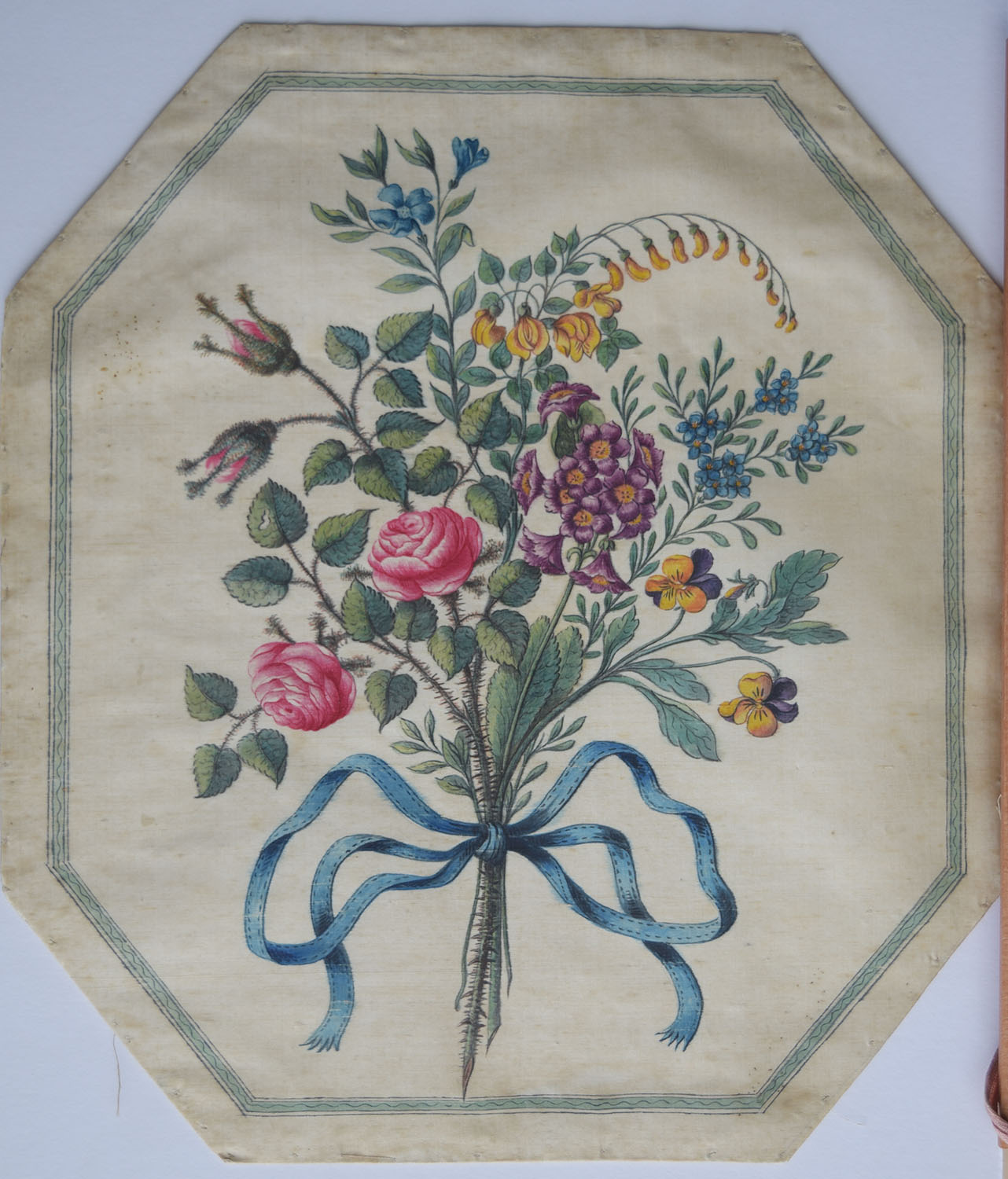
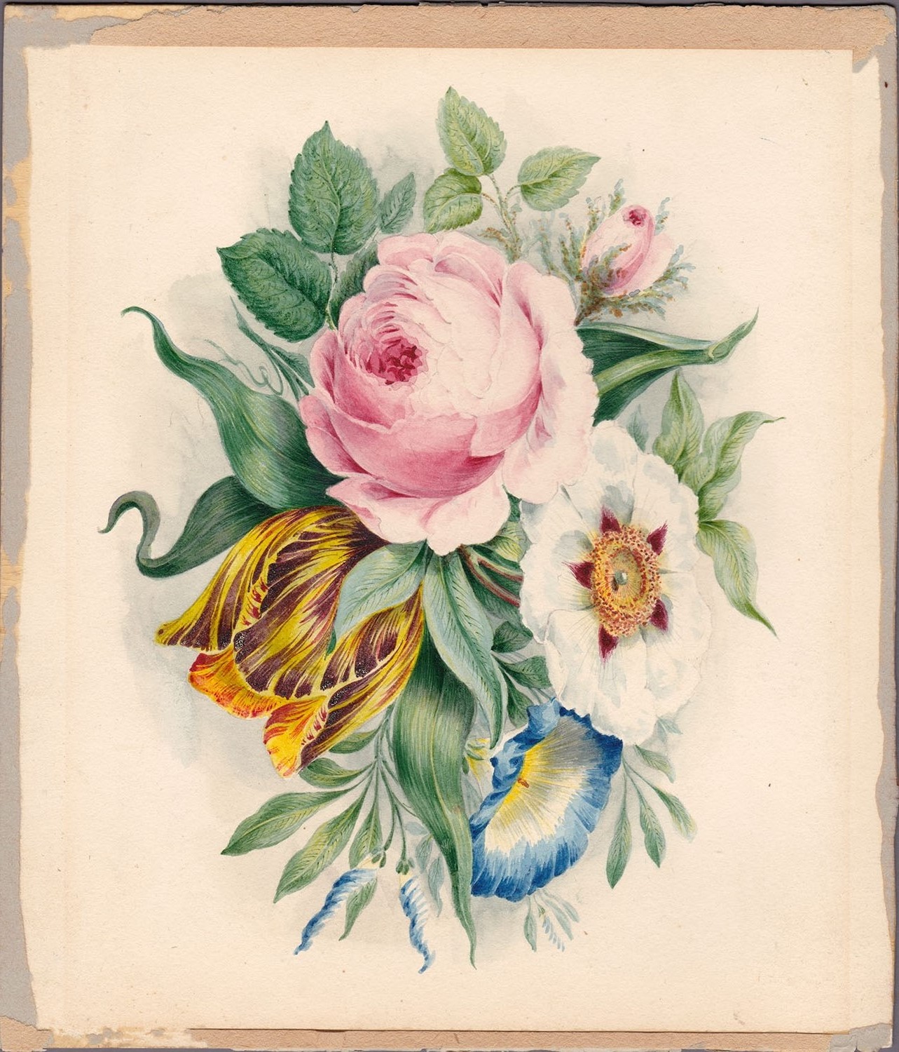
Bouquet of flowers, 1770s?
Watercolour hand-painted onto cream silk panel, stitched around octagonal card, 268 x 304 mm (overall) with approximately 30-40 mm overlap to all edges on verso.
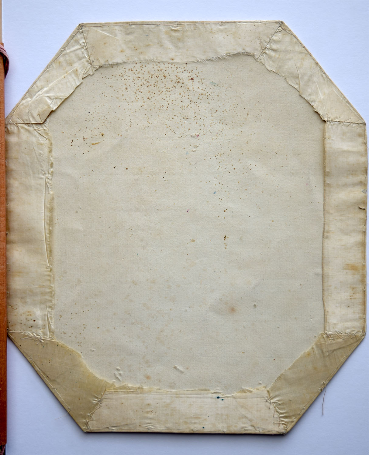
This is a panel of cream-coloured silk painted with a bouquet of various flowers tied with a blue ribbon and set within a washline border. The fabric has been wrapped around a piece of stiff card, and the overlap on the verso cross-stitched at the angles, and then sewn to the card close to the edge all round.

I could manage the identification of a couple of the flowers but began to struggle after that. Eventually I was forced to phone a friend. Thanks to the florally informed Lesley Dove, I can now offer some suggestions.
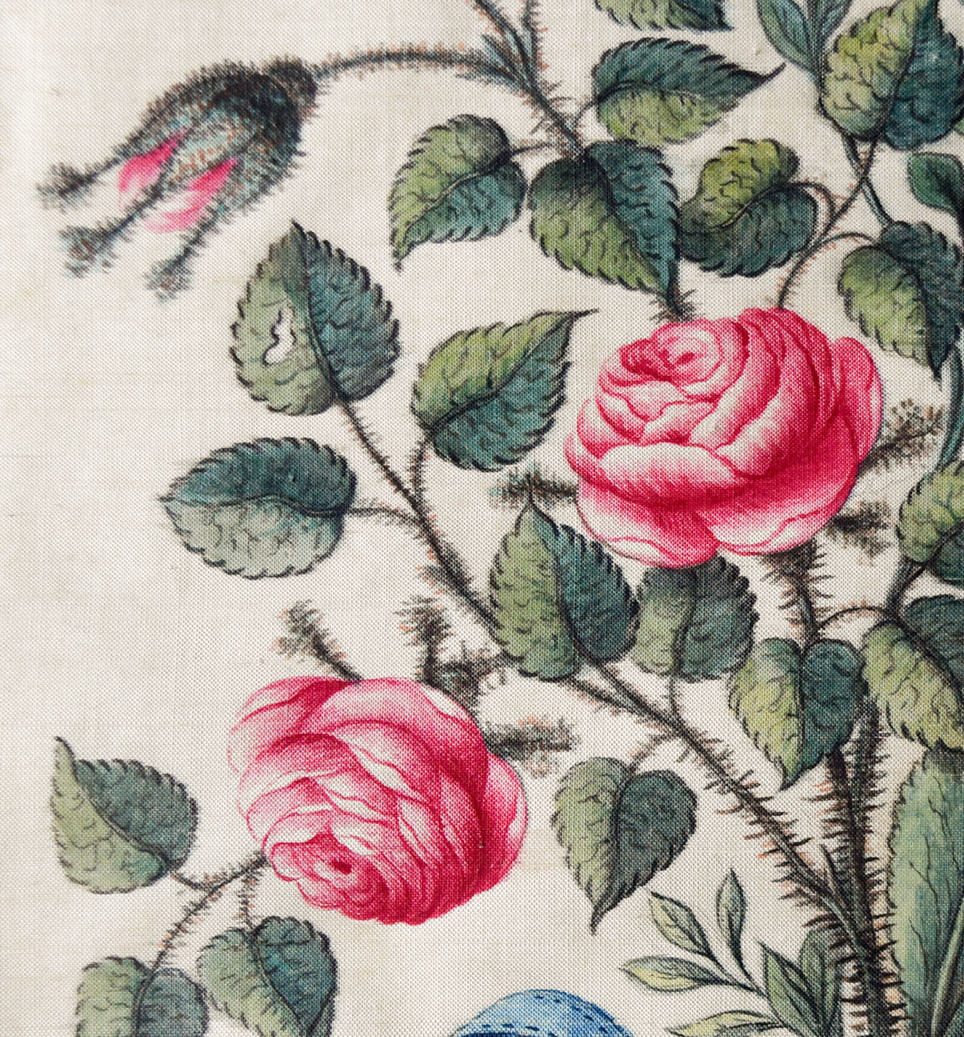
The most prominent flowers are pink roses, probably rosa centiflora. Such roses were extremely popular from the sixteenth century and hundreds of varieties were in cultivation by the beginning of the nineteenth. We encountered similar blooms in the previous instalment,
with similar ‘mossy’ buds, albeit treated more abstractly. Here, however the colour is more pronounced.
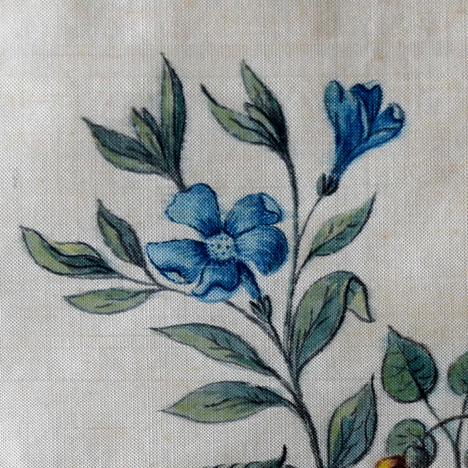
Next, at the top is a blue, five-petalled flower with a blue centre. This can be identified as a periwinkle, vicus minor. The splendid website http://www.plantillustrations.org, is a outstanding research resource for historical botanical illustration:
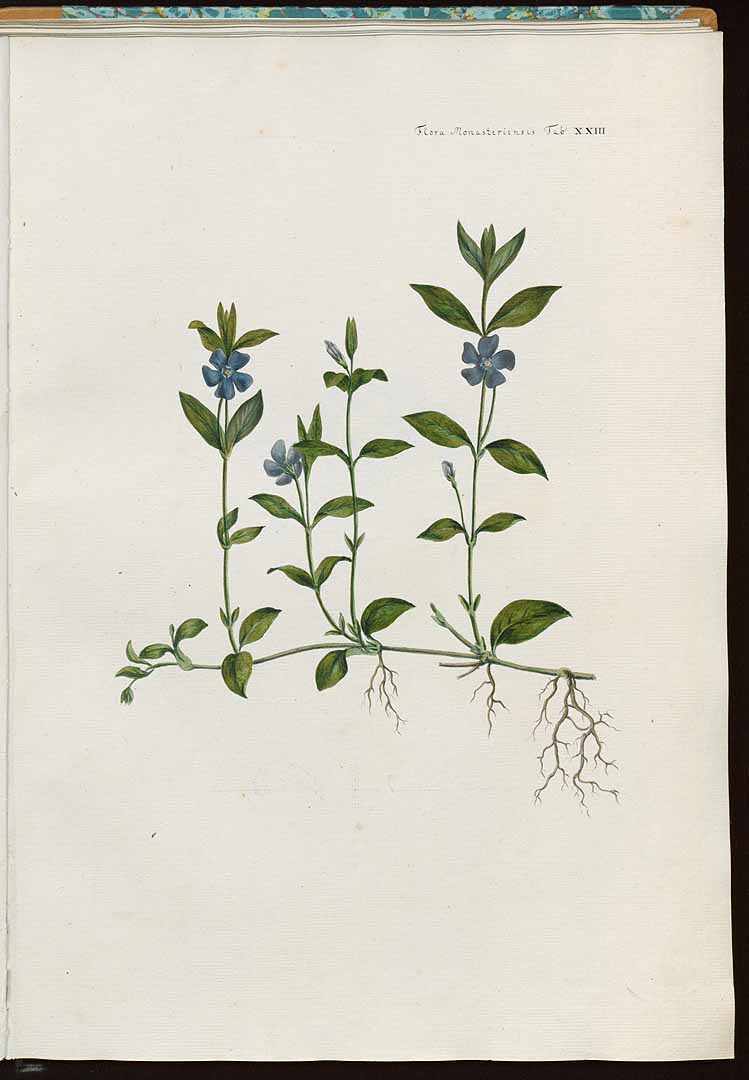
Source: here
The rose was a splendid thing, but the periwinkle is an altogether more modest creature. For the time being at least the selection of flowers here is trending more in the direction of a cottage garden than an aristocrat’s parterre.
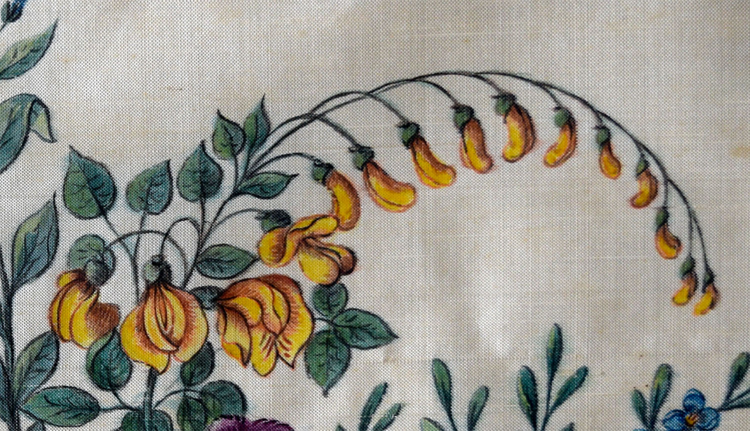
The cottage theme continues top right with a raceme of yellow pea-like flowers, possibly some variety of laburnum, such as laburnum anagyroides. The triple leaves are similar, but laburnum tends to flower in dangling racemes.
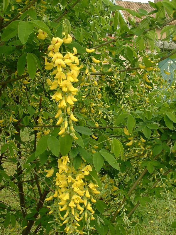
By J.F. Gaffard, licence GFDL – http://fr.wikipedia.org/wiki/Image:Laburnum_anagyroides.jpg, CC BY-SA 3.0,
https://commons.wikimedia.org/w/index.php?curid=750881
It is possible in this case that the drawing was made from a pressed specimen, somewhat like the following specimen in the Neuchatel herbarium, which has been arranged so that its flowers are all to the same side of the stem
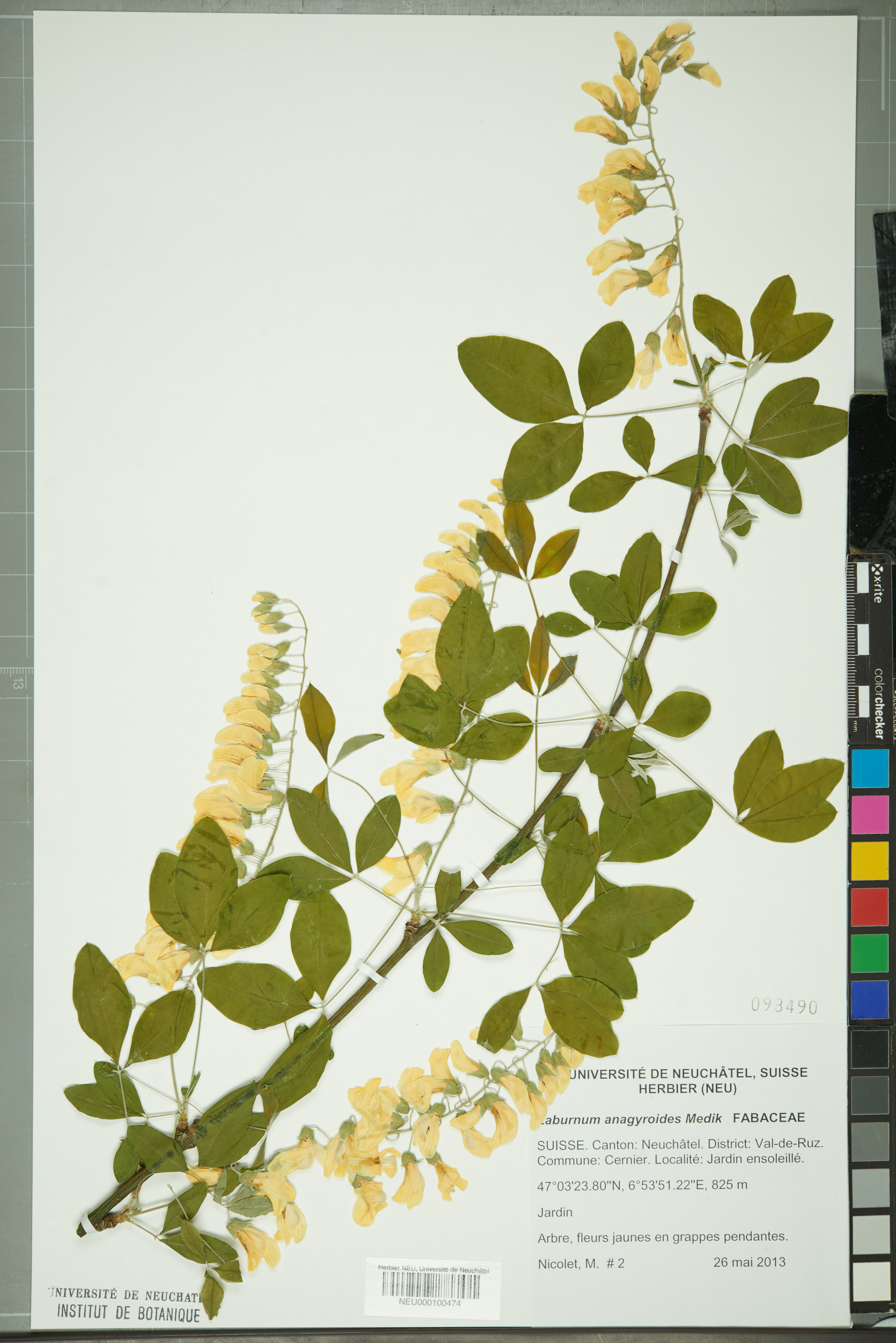
From the Neuchatel herbarium
Source wikimedia
In the eighteenth century this was also called ‘cytisus laburnum’, considering it to be a variety of broom [cytisus]. The common broom is cytisus scoparius, or Scottish Broom since it is so characteristic of Scotland and wild places in the late spring. This is certainly a laburnum, but once again, it would have been considered anything but exotic.
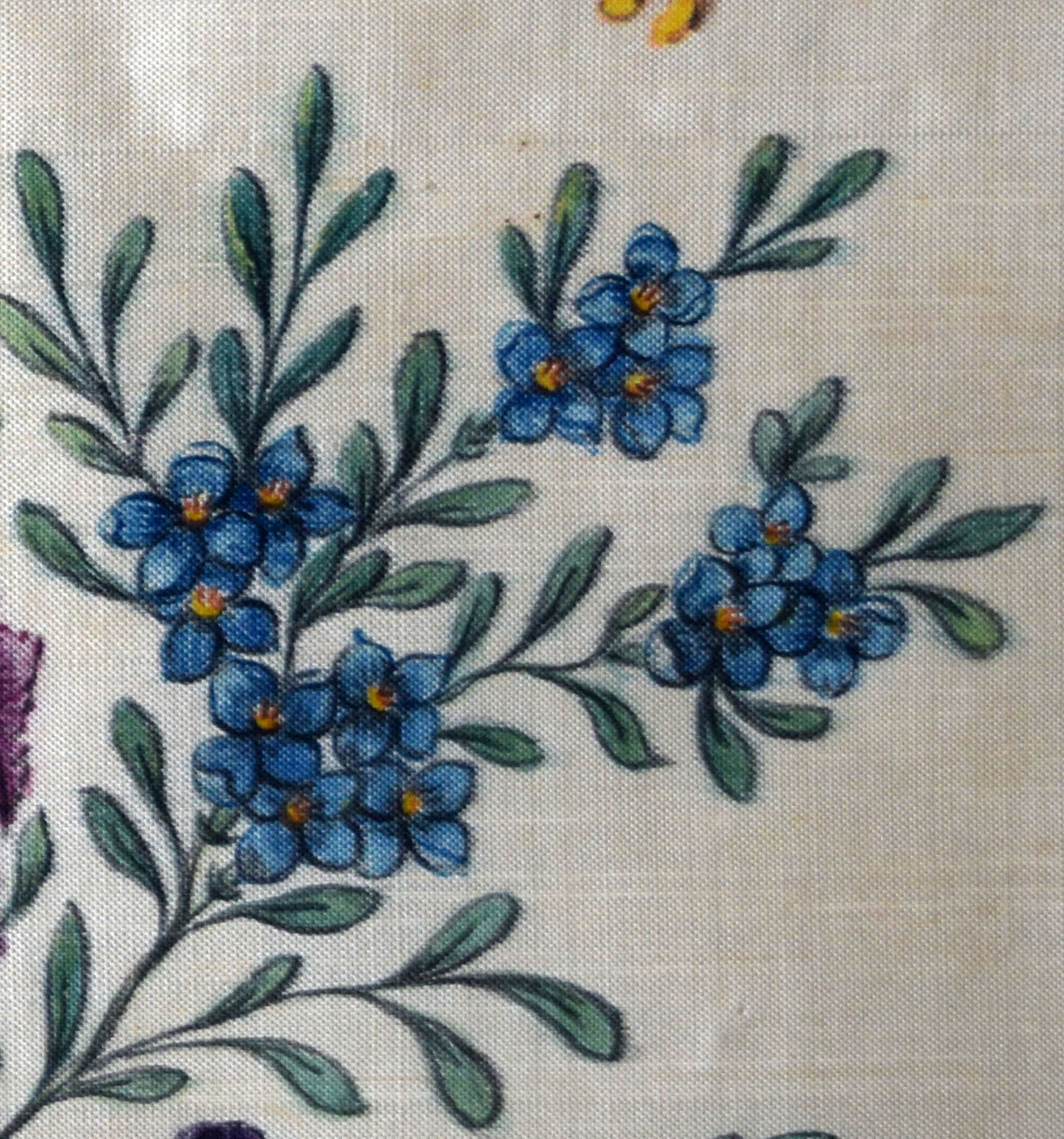
Next, centre right, is a blue four-petalled flower. This has caused me some consternation. At first, I assumed it must be a forget-me-not, but those have five petals. My floral instructor says that it is more likely a speedwell such as veronica chamaedrys. This seems convincing in terms of the flowers

Source:
but the habit and foliage is by no means an exact match. The forget-me not is perhaps closer in terms of foliage and the yellow centre,
Botanical illustration
Source: <a href=”http://http://www.plantillustrations.org/illustration.php?id_illustration=296928“>here
but not in terms of habit and the number of petals remains a problem. Any resolution to this problem will be gratefully received!
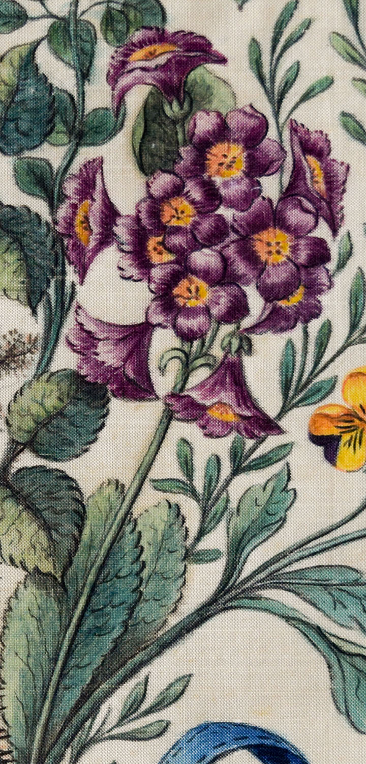
Towards the middle of the bouquet is a stem of purple, cone-shaped flowers. This had me completely stumped, but my floriferous guide went unhesitatingly for auricula. In my own casting around, I had looked up the colour in an edition of Werner’s Nomenclature of Colours published in 1817. The exact match is named as ‘auricula purple’. I was put off by the fact that this specimen is nowhere near so tightly formed as most modern varieties. I did, however, find one example of an illustration from the early nineteenth century
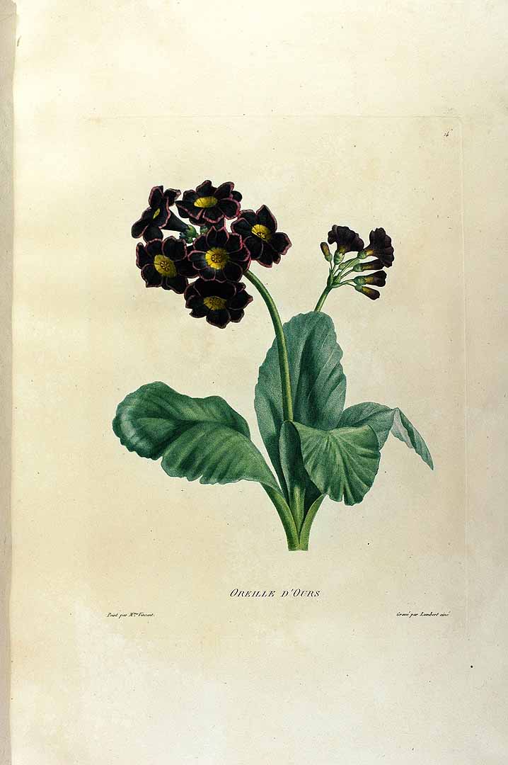
http://www.plantillustrations.org/illustration.php?id_illustration=205649
that is almost identical and which, together with the basal leaves at the base of the present bouquet, confirms the identification beyond any doubt. The source calls it by its traditional name of ‘Oreille d’Ours’ or Bear’s Ears, on account of the shape of the individual petals.
The history is interesting: Primula auricula is a cross of two wild alpine primulas, and its cultivation has been something of an industry since the sixteenth century. At times auriculamania has even rivalled that for tulips, For a brief history of its cultivation see here: A search on amazon will provide a whole shelf-length of further reading.
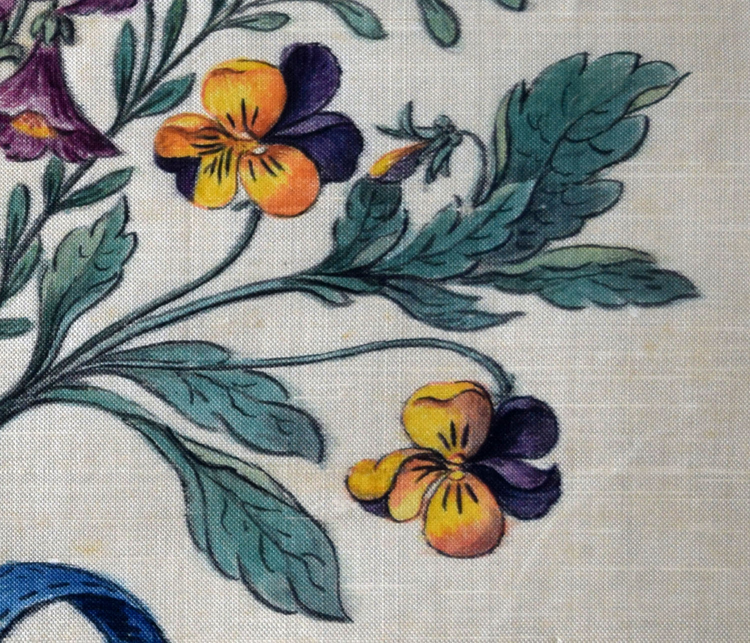
Finally, lower right we come to the wild pansy, viola tricolore, or heartsease. This seems to be the complete statement of this bouquet’s identification with common rather than rarified ground. This is the archetype of the wild flower.
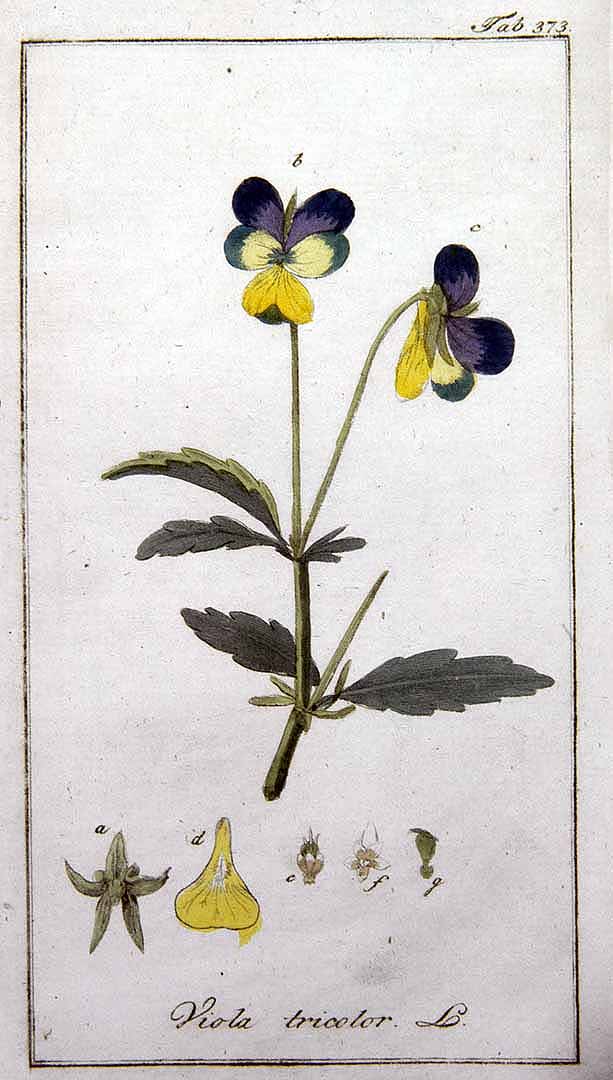
Botanical illustration, 1796
http://www.plantillustrations.org/illustration.php?id_illustration=151219(C)Guy Ackermans 2005
The history of this plant is particularly interesting. In fact, the first cultivated specimens were only launched onto the market in 1839, and at the time this silk was painted there was perhaps just the first stirrings of interest in the breeding of varieties.
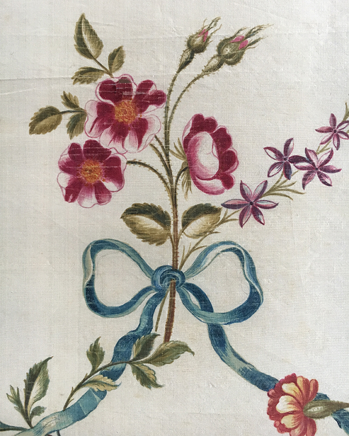
Image courtesy of Meg Andrews
There is no obvious indication of the date or of the artist, but I came across one very similar example on the splendid website of historic textile specialist Meg Andrews.

Image courtesy of Meg Andrews
This lot consists of three remnants of a panel of painted silk, signed by one Phoebe Holmes, and dated by Meg Andrews to the 1770s. Although the overall dimensions of the Phoebe Holmes specimen are considerably greater than the present piece, the motifs are about the same size, and the technique and palette similar if not almost identical.
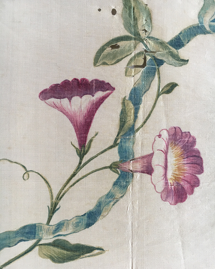
Image courtesy of Meg Andrews
The style is a little different. The present example suggests a more accustomed hand; as if our artist applied themselves regularly to this kind of work. Phoebe Holmes, on the other hand, appears to have been an amateur, and Meg Andrews suggests that her fabric might even have been painted for a wedding dress.
Painting on silk is a technical business. There is an inherent tendency for the colours to bleed freely. The website of SPIN [Silk Painters International] has a good deal of useful information and guide to contemporary materials (and an impressive gallery of contemporary artworks).
The only way that defined edges can be created is by first priming the silk so that the colour does not soak in, or by limiting the spread by defining boundaries with resists. Most artistic approaches to painting on silk seek to exploit the tendency for the colours to spread, rather than deny it. The approach in the present example has been, rather, to make the fabric behave as if it were paper being painted with watercolour.
There is also the issue of how silk can be coloured.
There are modern silk paints but even so they have to be fixed somehow to make them permanent. Generally, this involves some process using a chemical fixative or heat. In this case, it seems most likely that the silk was first primed, then the dye applied at the consistency of watercolour, and finally the result fixed by steaming, possibly under a hot iron. Even so, the present example has bled a little.

So questions arise; why go to all this trouble, and how widespread can such practice have been? In correspondence Meg Andrews has told me that skilled amateurs did paint on fabrics in this style. Painting like this on silk, however, appears to pose quite specific technical challenges. Success, it would seem to me, would imply the proximity of professional expertise. I am reminded, however, that the daughters of Dawson Turner became quite proficient etchers, perhaps an even greater technical challenge than painting on silk. But this was during a decade of close association with John Sell Cotman, when Cotman’s principal output was in etchings.
Bouquet of flowers, 1770s?
Watercolour hand-painted onto cream silk panel, stitched around octagonal card, 268 x 304 mm (overall) with approximately 30-40 mm overlap to all edges on verso.
Another question is what can have been the purpose of this particular piece of fabric? It is a distinctive shape, was clearly designed to be finished as this shape. The Phoebe Holmes fabric is a continuous design appropriate to an extended, repeating piece of fabric, but this is discrete and distinct in its octagonal shape.
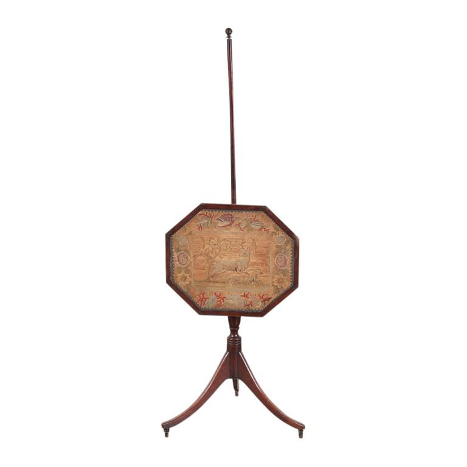
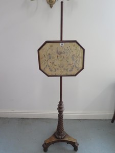
Looking for potential applications, I have wondered whether it might have been intended for a fire screen. In the eighteenth and nineteenth century such things were elaborated into an art form in their own right. It is fairly easy to find images of quite a number that could have held a design such as this.
A trawl through the National Trust’s collections turns up several interesting comparisons. Sadly, National Trust Images is somewhat behind the times with its cumbersome restrictions on image use [have they not seen how the BM, V&A and [eg] Yale Centre for British Art do this?] so I cannot actually show you the comparisons [at least without registering, applying, paying God Knows how much, and lo and behold, they are closed to new registrations due to coronavirus!] but at least I can give links that should open up to their image pages.
It appears that the fashion for pale cream and ivory silk sprinkled as it were with isolated motifs of posies and arabesque bouquets was at its most fashionable in the 1770s. Killerton, Devon has a wonderful dress from 1770 made with hand-painted silk imported from China.
http://www.nationaltrustcollections.org.uk/object/1363751
Despite its oriental origins, the details of the Killerton fabric are surprisingly naturalistic, and were presumably designed exactly for French and English taste. Killerton also has another fine comparison
http://www.nationaltrustcollections.org.uk/object/1363924
This is a dress made in the jazz age of the 1930s, but from a length of extremely beautiful eighteen century hand-painted Chinese silk.
Osterley Park has a pole firescreen from about 1760 decorated with hand-painted Chinese silk
http://www.nationaltrustcollections.org.uk/object/771815
and also has a suite of chairs dated 1770 that are upholstered in broadly similar hand-painted silk
http://www.nationaltrustcollections.org.uk/object/772421
and although its seems clear that although our design is both more naturalistic in observation and more formal in design, it still seems to takes its general aesthetic context from these Chinese designs.
We have already wondered whether our piece might have been designed to be used in a screen. Dyrham Park has a firescreen of about 1780, originally from Stourhead
http://www.nationaltrustcollections.org.uk/object/453041
It is perhaps a grander object than our design ever aspired to be, but imagined without the elaborate gilded setting, the painted silk design does bear some striking similarities.
Blickling Hall in Norfolk has a similar design dated c.1780 utilised on a pole firescreen, albeit embroidered rather than painted
http://www.nationaltrustcollections.org.uk/object/354294
and also in Norfolk at nearby Felbrigg is a hand-held fire screen
http://www.nationaltrustcollections.org.uk/object/1400583.1
also needlework rather than painted, and an altogether richer, probably later aesthetic, but nevertheless indicative of the possible context for which our piece was designed.
There are a number of similar items in the National Trust’s collections, some are described as fans. One at Castle Ward, County Down is Japanese in origin
http://www.nationaltrustcollections.org.uk/object/837251
Its octagonal shape is obviously comparable, but also is the manner in which the blooms and foliage is painted, although the overall effect is distinctively Oriental.
Another, also in County Down, at Mount Stewart, dates from 1857, but offers a very strong comparison in terms of potential use.
http://www.nationaltrustcollections.org.uk/object/1656837
Like our example, this is painted on silk and mounted on card, but in this case slipped into a professionally-made handle. It appears that this must have been made precisely so that the owner could insert their own fan paddle into the holder. The general technique is similar, and to some extent the motif, but there is a world of difference in terms of stylistic sophistication. The Elizabeth Londonderry in question must be Lady Elizabeth Frances Charlotte Jocelyn (1813-1884) the wife of the 4th Marquess of Londonderry, aged forty-four when she painted this. The comparison rather reinforces the suggestion previously made that the present example might have been painted by a professional.

The delicacy of the fabric and of the imagery, however might suggest a certain quality of intimacy in the original context. Meg Andrews very kindly drew my attention to another piece in her archive that was an octagonal flower design on silk that was produced in 1816 as the centrepiece of a quilt.
A Bouquet of flowers, comprising of white rock rose, blue morning glory, yellow and brown striped tulip, and pink rose, c.1820?
Watercolour on cream wove paper backed onto card, 175 x 203 mm. Glue marks round edge of recto, where formerly affixed into a mat. Inscribed in pencil on verso ‘A [or?G] E Messand [?]/ 10 New Court’ and in blue pencil ‘11 ½[?] 410’.
By coincidence the floral spray has a similar aesthetic quality to the previous bouquet that we discussed in this series,
The octagonal shape and intended soft context of the 1816 piece compares to the present example, but the fact that the fabric is actually stitched to the card round the edges is very specific. Meg Andrews offered the suggestion that this must be for presentation for framing. My independent floral adviser, Lesley Dove, supplements botanical expertise with skills in stitching and sewing, and Martin Dove, her husband knows a good deal about framing. They offered exactly the same advice.
So perhaps it was made for some functional setting but later stitched to the card for preservation. In that regard it is perhaps worth tabling the suggestion that the octagonal border might have been added as an afterthought. It seems significant that the lower tip of the stems interrupts the lower edge of the border as if the painting was first stitched to the octagonal card, and the border then added at a judicious interval from the edge. So it seems possible that this painting had a prior life and was subsequently mounted and given its border. In any case, even if we cannot be certain of any original functional context, it is plain that the piece ended up being preserved in the portfolio as a sentimental and aesthetic object. We seem now to have a sufficient sense of the piece to provoke some question of the occasion.
The present example seems close enough to the Phoebe Holmes piece as well as the National Trust fabrics so as to share a similar date. Meg Andrews suggested that it might be any date from the 1770s up until the Regency period. In the present context of the Twopeny portfolio, that would make this the oldest object in the portfolio, and possibly by some margin. We might presume, therefore that it was of some family historical significance and sentiment.
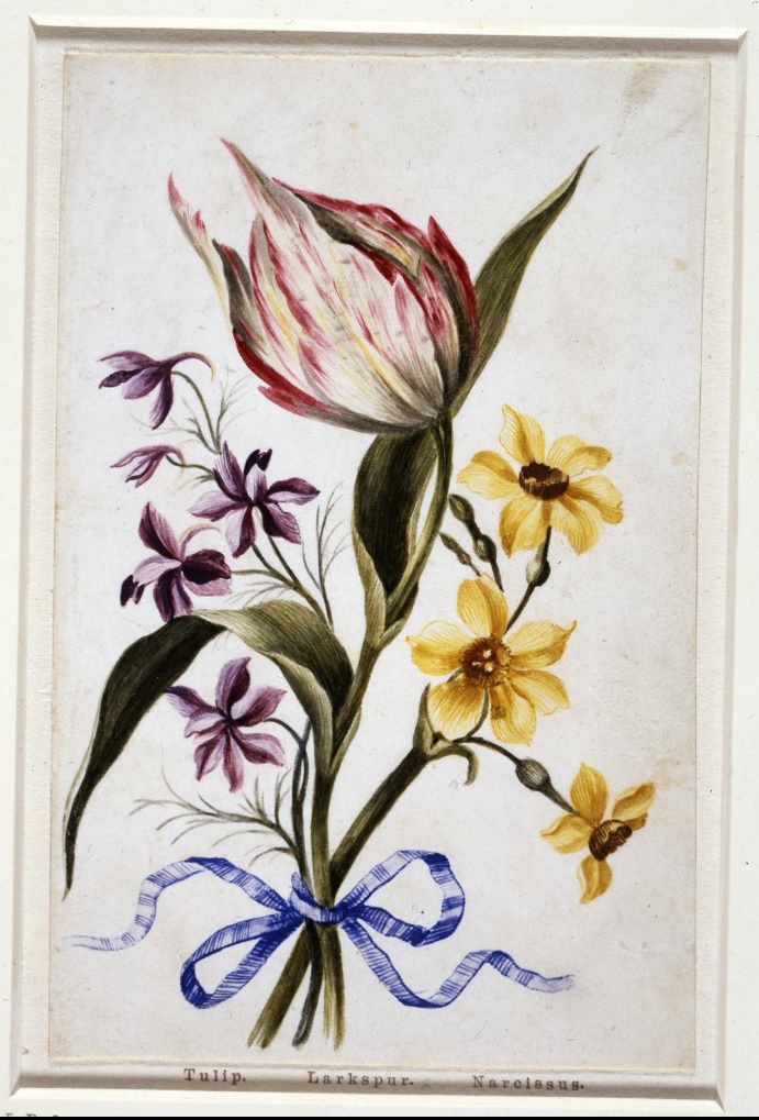
Bouquet of Tulip, Larkspur, Narcissus c.1640?
https://www.britishmuseum.org/collection/object/P_1878-1214-64
The design concept, a simple bouquet laid out against a plain background and tied with a ribbon seems to date back at least into the seventeenth century. There is an album of flower drawings by Alexander Marshall [or Marshal] at the British Museum that provides almost the archetype of this motif.
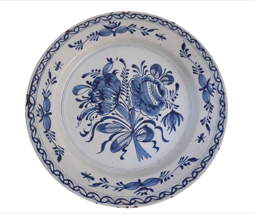
By the second half of the eighteenth century, the motif could be abstracted into pure arabesque as in this Delft plate design.
The present design is less botanical in its priorities than the Marshal and more stylised in its arabesque patterning, but more naturalistic and much more restrained than the Delft design, but nonetheless we can infer that the motif, however iterated in contemporary context, invoked a sense of tradition and historical depth.
In any case it seems possible that it predates the lifetime of Sarah Parkin, in whose portfolio (see here) this item was found.
It is the only one of the entire collection of drawings that I am certain was physically inside Sarah Parkin’s smaller portfolio when I first examined the contents.
The other two flower drawings were photographed alongside all the other drawings when the portfolio was auctioned in 2017, but this was not included in that array.
So with only a very slight caveat that the connection to Sarah Parkin might not be absolutely certain, it looks very strongly that we must look to her, at least in the absence of any other leads, for the origin of this piece. Given a starting point of a date in the 1770s, we might look in the first place to sometime in the twenty years before her birth in 1796 to find an occasion.
Sarah Parkin’s mother, Sarah Margaret Macdowell married Hugh Parkin in 1795. She was born in 1776 so her entry into the world might well have been a possible occasion of presentation. Her parents in turn were a surgeon, William Macdowell and his wife Sarah. I have not yet discovered when they were married but presumably it was in the years prior to the arrival of their daughter, so perhaps in the 1770s. Nor have I managed to discover the dates of either grandparent, or the grandmother’s maiden name. The marriage of William and Sarah Macdowell, however, if it occurred in the early 1770s might also have been an occasion for the gift of this painted silk. One detail that I have discovered, however is that Sarah Macdowell was widowed [I do not know when exactly] and remarried a Charles Deane of Whitehaven He was a mariner who served as a commander on the East India Company’s ship Earl of Sandwich which made four voyages in the period 1771-82. We do not know the date of the remarriage of Sarah Parkin’s grandmother, but that might also have been an occasion for the creation of this piece.
It seems possible that the flowers themselves might hint at the occasion. The roses symbolise Romantic love, which might indicate a marriage, as might also the ribbon which literally expresses a binding or tying together. The periwinkle has a wide range of associations, one source lists “fidelity in friendship”, “warm memories” and “remembrance of things past”, together with “honesty”, “truth” and “faithfulness” whilst another stresses new beginnings, an important step and the beginning of a new chapter. Laburnum is associated with pensive beauty, possibly forsaken; Veronica signifies fidelity; Auricula deserved merit and the Pansy a condition of thoughtfulness or reflection. If the occasion of creation was a marriage, the symbolism is qualified by a strong sense of something lost as well as begun.
In the associative spirit in which all this is invoked, this does seem to point towards the elder Sarah Macdowell’s remarriage to Charles Deane. I have wondered in passing, whether Charles Deane’s Indian connections might have any bearing on this case? It would no doubt be interesting to add further detail to all this. It would be good to find out when the remarriage occurred and what life the couple enjoyed. Particularly one would like to form some idea of what opportunity the young Miss Parkin might have had to associate with her grandmother. In any case it is not hard to see how sentiments such as these might have become wrapped in the fabric and its decoration.
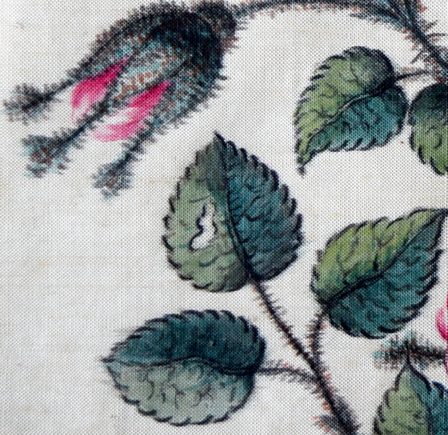
One final detail is worth a mention. Amongst all this meticulous craftsmanship, one rose petal at the left has had a hole chewed through it. The most likely culprit is a rose sawfly caterpillar. The inclusion of this detail is on one level almost entirely unnecessary in an image whose primary purpose is to be beautiful, delicate, sensitive, poetic, and pleasing. To think of introducing it at all suggests a level of critical purposefulness and awareness. It suggests that natural beauty must always be threatened by an incipient contagion. Sounds like another echo of coronavirus, especially in the way that it has blighted an otherwise scintillating Spring. The deliberate imperfection has expressions in many cultures, and might here suggest an idea of the East. However that might be, it certainly suggests an informed degree of intentional symbolic intelligence at work in this. One that appreciates that any pretence to perfection in the world will always contain the germ of its own transience. A fact that should make us, as we must surely have learned recently, never take anything for granted.

TO BE CONCLUDED:
Next, the final instalment and a step into the world of photography
