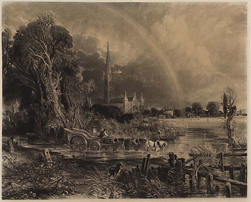
This is the sixth part of an examination of the various states of Constable’s mezzotint of Salisbury Cathedral from the Meadows. This was engraved by David Lucas under the artist’s close supervision between late 1834 and Constable’s death on 31 March 1837. Here we begin the second section of the catalogue of states:
Impressions with title and publication line of 20 March 1837, taken under Constable’s supervision
On 17 February 1837 Constable wrote to a friend, ‘My great Salisbury print is done’. Three days later on the 20th [Beckett p.434] he wrote to Lucas with regard to arrangements for publication. Constable was now agitated over the lettering:
We are all at a standstill about the plate. We know not how to entitle it. I have seen Hodgson on the subject [i.e. John Hodgson, partner in the firm of Hodgson and Graves, who were publishing the plate.] He would prefer it with a ‘Dedication’, of some kind, to give it an eclat. I left him, with a promise to get a title sketched, & send the person to me. This he did not do – & a few days are now lost. I sent to him for the address of the writing engraver & he sends it – Mr Becker, 18 Euston Square, New Road. Is he the same as yours?
I saw Chantry [Sir Francis Chantry, perhaps the leading sculptor of the times, lately knighted in 1835] on the subject, & told him my perplexity – he said he would try to help me. I asked him to allow me to dedicate it to him. He said, ‘Cannot you find a better man than me?’. I said, not in my estimation.
I wish to know, if the Mr Becker is your man, that I may see him & get him to sketch a plan for me leaving space for a name.
From this it seems Constable wanted the script engraver to sketch out the required lettering in such an arrangement as to leave room for a dedication to be added once decided upon. It does not appear to have occurred to Constable that the script writer might be a busy man with other clients requiring his attentions. In any event a sketch of the lettering was done as requested, with the title set somewhat oddly to the right, so as to leave room for the intended dedication.


The various exchanges enable us to establish a precise window of time in which the plate must have been inscribed, that is between the date of the last letter, 20 February and the stated date of publication. A title of ‘The Rainbow/ Salisbury Cathedral’ was decided upon, as was a publication credit of ‘London. Published March 20 1837 by Hodgson & Graves Printsellers to the King, 6, Pall Mall.’ The plate must have been inscribed soon after the date of the letter for the proposed date of publication is only a month afterwards, and sufficient time must have been calculated for the plate to be properly inscribed, printed, editioned, packed and distributed.
Shirley took the evidence of the publication line and date at face value, and assumed that all the lettered prints had been printed and published on that date or soon after. Shirley evidently did not know of a letter from David Lucas dated 8 September 1846 [Beckett, IV, pp. 440-1]
‘The large plate of the Salisbury is in the possession of Mr Constable’s family and probably will soon be published, it was on the point of being done at the time of Mr. Constable’s death, which was the cause of it not being made public before.’
Constable died on 31 March 1837, his demise coming as a complete bolt from the blue. On the basis of Lucas’s testimony we must now set aside Shirley’s classification of impressions with the 1837 publication line as the ‘first published state’. In fact as Lucas intimates, plans were only just reformulated for its first publication at the date of his letter. In the event the first properly published edition was issued by Gambart & Co in 1848. (see state 4, to follow in due course). We have a considerable number of further progress proofs to work through before we approach that stage.
We have little idea of how many impressions were printed of any state. We might remember that Constable asked Lucas to print off a small number of a very early state (see 01a) and it appears that some states enjoyed a limited degree of circulation. Up to this stage, however, I have managed to find only one impression to illustrate each state.
02a
Shirley gives an example at the Victoria and Albert Museum in London to represent what he thought of as the first published state.
Shirley Ist published state [P]: ’24 3/16 x 28 3/16. S 21 ¾ x 27 1/8. 1. Lettered: Painted by John Constable R.A. Engraved by David Lucas. The Rainbow Salisbury Cathedral (cursive) – London. Published March 20 1837 by Hodgson & Graves Printsellers to the King, 6, Pall Mall.– V&A. The spire and sky lighter; the rainbow retouched top l. and very bright where it meets the water.’
The only candidate in the V&A online catalogue is E.19-1987, which is still housed in its original frame, but is not reproduced. I am hoping to make arrangements to examine this in the near future.
This is possibly identical with an impression at the Royal Academy which to date is the earliest lettered impression of which I have a reproduction.
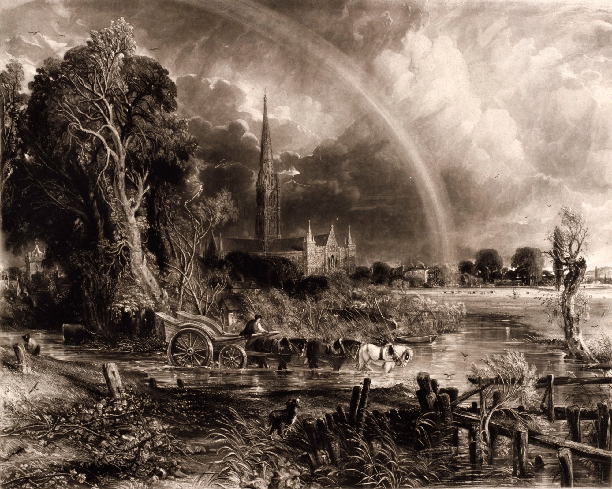
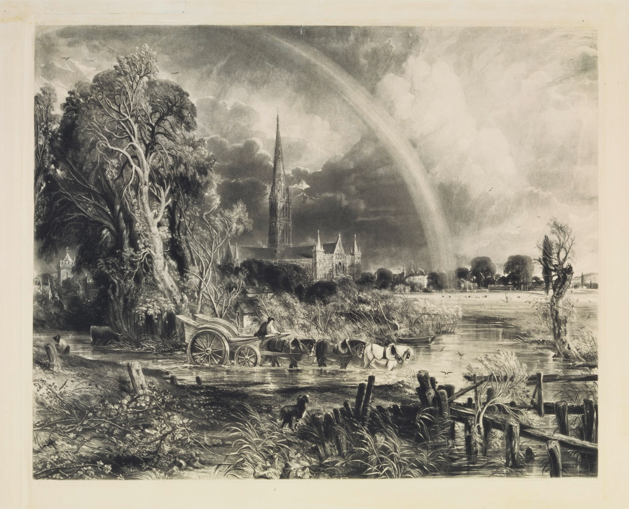
It is of special significance since it was presented to the Academy in 1840 by David Lucas himself. We might regard it on that basis as representing the complete development of its tonality, handling and detail. There is a gradation of activity that seems to recede infinitely beyond the immediately visible, as if nature itself was enacting the picture. The Royal Academy state is, so far as I can discover, unique, and although Lucas struck proofs of a few more revisions while the plate was still at this peak ithese, too, all appear to have been unique. As we now know the proposed extended edition was cancelled, and the plate set aside for a decade.
The previous instalment, part 5, examined many of the changes made to the plate immediately before the lettering was applied. The RA impression is the principal evidence of the appearance of those changes, so it will perhaps be useful here to list the principal innovations since the Chicago proof.
- The rainbow is much broadened and brightened along its whole path, especially so in the upper part, and returned in the top left-hand corner.
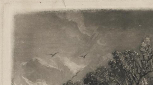
- Various birds appear in the sky. One between the spire and the bow; another three at the right about half-way up the composition, and another barely visible in the deep right distance high above the pollard willow. Shirley records that these features [or some of them] first appear in his proof (f – see above) but that has not yet been verified.
- Shirley notes that his first published state at the V&A has ‘The spire and sky lighter; the rainbow retouched top l. and very bright where it meets the water.’ The spire was first lightened, however, in the Chicago proof, but here it has been toned down again. The sky appears no lighter here than it does in the Chicago proof, but the rainbow is much more intense in its lower part and also carried down through the meadow. The surface of the water to the right of the rowing boat has been comprehensively brightened in reflection.
- The dog’s tail is reworked and given a more characterful swish.
- The bank is made much brighter at the bottom left, some foliage erased below the leftmost post, and new highlights added top and mid left of the leaning post.
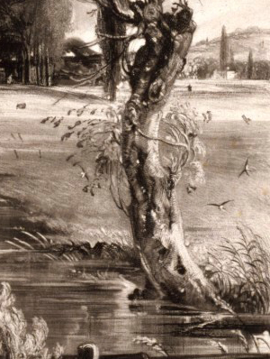
- The ‘serpents’ nest’ of branches at the upper left of the principal tree is thinned out to a more naturalistic configuration
- The area around the head of the lightning bolt is reworked to give a more explosive effect, and its path to the ground tidied and simplified
- Highlights on the trunk of the principal tree and around the elder bush are considerably brightened
- Highlights on the bank below the white horse are reduced
- Branches are added to the left of the pollard willow at the right.
- The meadow below the shepherd is sprinkled with dark strokes – possibly to represent a birds wheeling over the grass.
- The figure in the far right distance is darkened, and the strokes below [probably birds] are altered, though not made more legible.
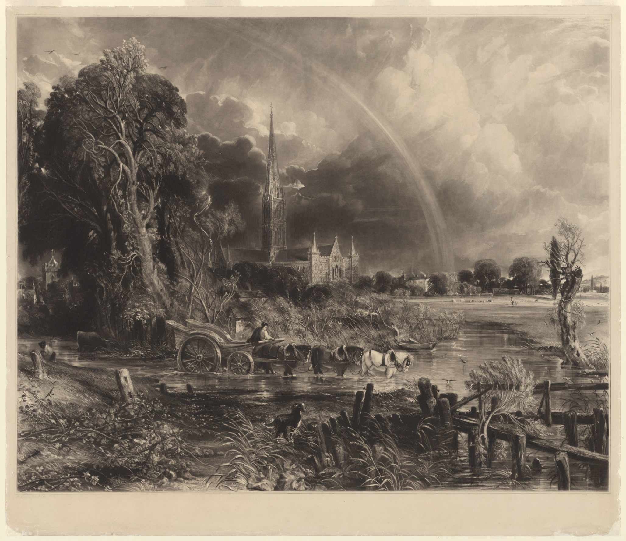
There was, however, no state of perfection in which Constable could not find room for improvement. An almost identical impression appeared at Reeman Dansie auctions of Colchester on 27 September 2022 (lot 1064). It must have been taken within days of that at the Royal Academy, but nonetheless shows several, albeit slight, improvements.
02b
The diagnostic improvements in this state are:

- The foliage below the leftmost post is reinstated and the shadow of the leaning post is reduced.
- The tiny bird in the distant sky right, about level with ball at top of spire, is removed

- Highlights on the trunk of pollard willow at right and around the base are reduced. The meadow behind is darkened both sides. The grasses to the right of the pollard willow are heightened, and some darker grasses are introduced to the left of the trunk above the riverbank
Perhaps none of the latest changes amount to anything more than last-minute tinkering. It appears that no firm date had yet been set for printing for on Saturday 18 March, only two days before the inscribed date of publication, he wrote to Lucas with yet more suggestions. In addition to those changes it also appears that he had at last settled on the dedication that the plate should carry.
Dear Lucas
I send you the proof, fearing you are ill.
I know nothing of the letter engraver. Delays breed losses. I am anxious to show my dedication to Chantry.
It appears that Constable hoped to see the dedication inscribed and proofed, so that he could show it to the sculptor. Progress in this area, however was evidently impeded by a lack of response from the letter-writer, and in the event the dedication was never added. This raises a possibility that does not appear to have been previously discussed. The lettering as it appeared on the plate is extraordinarily faint. It was so lightly scored that it barely survived the printing of a few impressions. The publication line particularly so.

It seems likely that this was always intended to be provisional – a ‘sketch’ only of the layout as Constable said in his letter above of 20 February 1837. Usually progress proofs had lightly scratched inscriptions, and full-length editions were lettered either with struck letters or with deeply carved or etched script. But the lettering here never reached the publishable stage. Certainly the planned dedication to Sir Francis Chantry never appeared. Professional letter-engravers were no doubt busy people, and given Constable’s prevarication, the plate missed its slot with Mr Becker.
The letter continues:
..Mr Cooke the Royal Academician, said yesterday that the Salisbury was a very fine thing.
I hope that obliging – and most strange – & odd ruffian your printer, will be allowed to have his own way in printing the plate – that is, now we see that we must not be ‘too full’. It is as [he] says only fit for ‘a parcel of painters’. It will not be liked, any more than the English Landscape, if it is too smutty.
Constable was clearly aware that printing was imminent, and obviously had an acute sense of the qualities he was hoping for. He appears also to have been aware that his own taste tended more to artistic than popular taste.
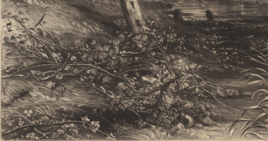
Still it must not be ‘bare and bald’ – not too close – mellow & full, but clean & fresh – and rather (much rather) inclining to brown & grey, in tint. I send to spare time. I now mention what I wish done, a little touch where the shadow of the post was taken away. It now looks monotonous, unmeaning & bad. A shadow struck as I have put it beside the second post & old woman will do good – so necessary to the water, thus – vide proof.


The dark shadow referred to here is a key diagnostic detail in the sequence (see 02c, below). The new shadow extends from the old woman rightwards along the riverbank, passing behind the second post until it joins the existing dark shadow on the bank below the back of the wagon.
Next the cloud near the bow on the right – about midway – is too sharp, for about two or three inches – see grey chalk, & compare these changes with those you have.


The sharpness of the edges of the rainbow were significantly softened, and so it appears to have rested, at least for a little while.
Apart from seizing every opportunity to make last-minute adjustments, Constable appears to have been attempting to turn the printer into a creative ally. He seems to have been especially pleased to find him malleable. An undated letter presumably fits hereabouts:
Dear Lucas,
Your man has told me there is every reason to know that it will print both fuller & richer. Tone- tone is the most seductive, entrancing & best inviting quality, a picture & a print can possess – it is the first thing seen – and like a flower in full blossom invites to an examination of the plant itself.
No artist felt more the power and the subtleties of tone than Constable, and certainly none ever articulated their sensitivity to it more beautifully.
Your man is a droll fellow. I have given him two shillings – but before he had told me that he is ‘given’ to break out on a Saturday night – but it does not last long, but generally goes off on the Sunday morning. He cannot help it – he can’t even account for hit but ‘so it is’.
[PS] This is his own gratuitous account of himself – what a singular creature is man – either cultivated or not – either civilized or wild.
I have offered him [either] rum & water – or gin & water – all of which he refuses, almost with loathing – perhaps his hour is not come yet.
Tone- tone is the most seductive, entrancing & best inviting quality, a picture & a print can possess – it is the first thing seen – and like a flower in full blossom invites to an examination of the plant itself.
The mezzotints that Lucas made under Constable’s supervision represent one of the finest realisation of the aesthetics of chiaroscuro in the entire history of art. The print of the Rainbow: Salisbury Cathedral, the pinnacle amongst even these. Yet very few now seem to have any appreciation of their significance, and examples are still knocked down for derisory sums. The repetition of Constable’s principle seems all the more worthwhile to a world on whom its import is almost completely lost.
02c

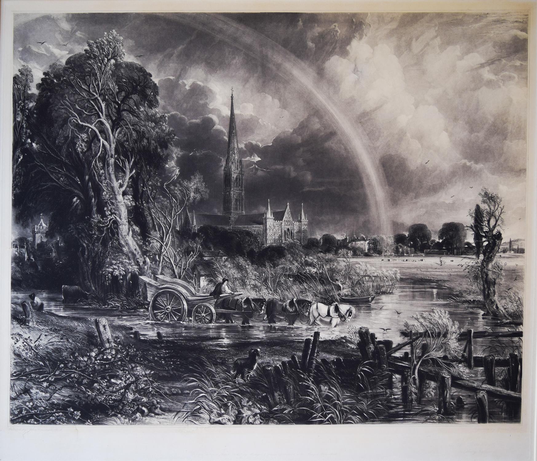
The changes requested in the letter of 18 March 1837 are first represented in an impression sold at Bonham’s, Oxford, on 8 September 2010, lot 12:
This state appears to immediately follow the Colchester 2022 impression. It is a little unfortunate that the mounting appears to conceal the top 2 cm of the print. Otherwise the same details are present except for the revised riverside shadow and the softening of the rainbow, principally to upper part – and a darkening of the line of trees at the bow’s base. The alterations to the bow make it seem to hang more diaphanously in the atmosphere, but the new work has flattened the formerly dramatic expression in the sky between the bow and the cathedral.
There is another impression of the same, except in india proof, sold at Swann Galleries New York on 2 May 2002 lot 100. This appears to be the first instance of more than one impression surviving of one state. Except, that is, that this impression was printed on india paper. This format – where the plate is printed onto a fine sheet of tissue, which is bonded in the press to the backing sheet of etching paper – was an especially skilled process which yielded the ultimate quality of impression. It was normally reserved fora very small number of impressions reserved for connoisseurs. Perhaps Constable wondered what it might be like printed in such a luxe edition.
To this group we might add a third impression at Manchester City Art Gallery (1920.431):

The image in Manchester’s online catalogue is low resolution and evidently over-exposed in the centre and upper left, so its tonality appears to differ significantly from the other reproductions. The detail however is sufficiently alike to place it here pending a proper examination.
The inscribed date of 20 March passed without the plate being printed. Constable now seized upon the opportunity to ask Lucas to make a major reworking of the rainbow. His instructions are given in an undated sheet that Beckett (p.436) places immediately after the letter of 18 March 1837. It must immediately follow the previous round of suggestions for Constable commends the effect of the shadow along the riverbank that was first introduced there. His main concern is now almost exclusively with the rainbow, which has been a core concern throughout.
I have had much anxiety about the bow – it never has been quite satisfactory in its drawing to my eye. John and I have now clearly and directly set it out – and in the most accurate manner possible, which must obviate all cavillings, & carping, from the learned ignorant.
Pray do it, and if you are frightened, see me – but it can most easily be done. It will at once obviate the look of the Gothick arch, with lancet top, this – see above scratched with my pen (Sketch]
Flattening at the left hand corner [sketch] will do great wonders, & give great beauty & correctness – also the rest, as it is but little out & not any part to fill up, with shade.
The shadow by the old woman between the posts does much good. Let your amiable ruffian print clear.
[PS] Joe shall bring the bow proof back if you like to see it with me first…
I have put a pin in the centre of the rainbow. It is in the elder bush.
By 29 March 1837 Lucas appears to have sent a progress report, and Constable replied with further encouragement:
Dear Lucas
I am quite pleased to see how well you are preparing for the new bow. The proof is about what I want – I mean that you took hence.
I took the centre from the elder bush – a blossom to the left – you will do possibly the same.
Go on as you think proper. I go to a general meeting on Thursday (tomorrow) evening. I dine at the Charter House on Saturday.
We cannot fail of this plate with a proper bow.
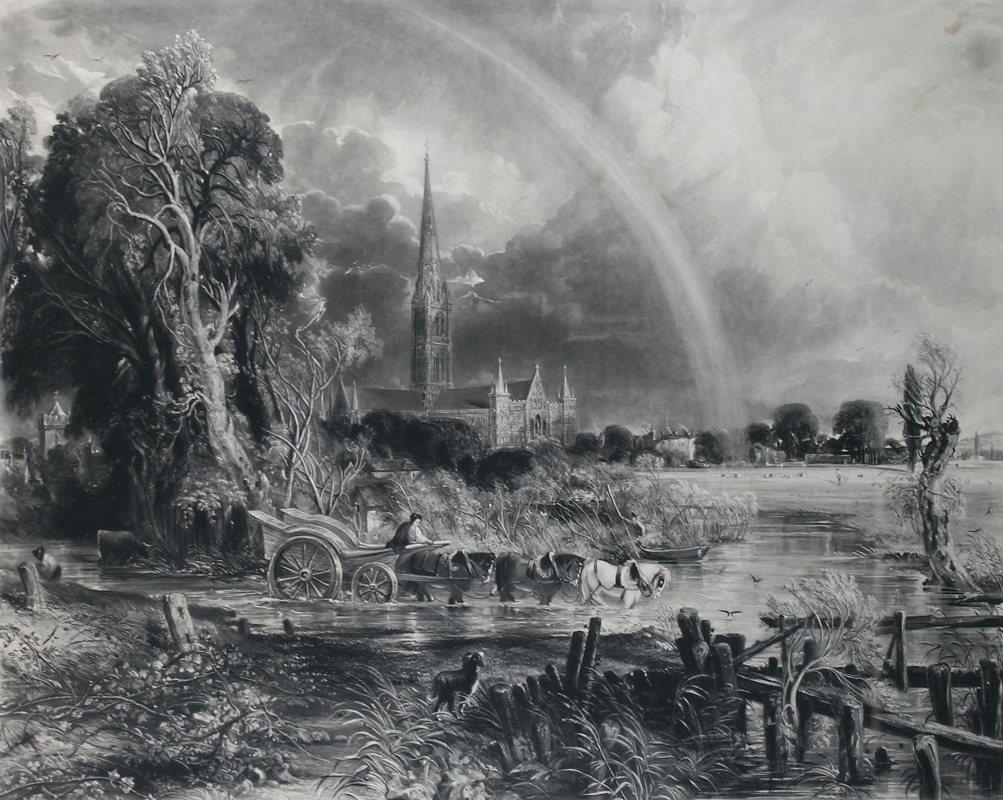
Lucas’s initial – somewhat pedantic – replotting of the rainbow is represented by an impression at the British Museum (BM 1842,1210.1.) which is so distinctive as to make it surprising that Shirley does not mention it specifically.
02d

The British Museum online catalogue describes this as the ‘published state before reworking with fine cursive lettering and the title in lower right. 1837’. The description details that the impression is ‘Lettered below the image, all in fine cursive letters [now very faint] ‘Painted by John Constable R.A. / Engraved by David Lucas / London. Published March 20, 1837, by Hodgson & Graves Printsellers to the King, 6, Pall Mall / [lower right] The Rainbow Salisbury Cathedral’. It may be observed that the commentary implies that the inscription was worn faint. As we have seen it was never any stronger than it appears here.
The general details follow the Bonhams impression (02c), except for the complete reworking of the rainbow. The whole course is brightened and widened, its edges made more distinct and its brightness increased in front of the distant trees and over the meadow. In the process Lucas also cleared the detail in the coud between the cathedral and the bow.
It seems plain that Lucas had faithfully redrafted the interior and exterior circumferences from Constable’s centre. Given the previous repeated interventions to soften and vary the edges, such definition was never intended to subsist. Lucas accordingly reworked the edges entirely, as well as the top left-hand corner. Constable appears to have instructed this with his comment in the list already given that Flattening at the left hand corner [sketch] will do great wonders, & give great beauty & correctness – also the rest, as it is but little out & not any part to fill up, with shade.
The first results of this are evident in a proof sold at Christie’s 19 April 2011, lot 67
02e

The details are identical to those of the BM impression except for the rainbow being returned to evanescence at the top, and its return much subdued at the top left. One recognisably diagnostic feature is that new ground was applied to the sky from a couple of centimetres in from the left to a little past the half-way point along the top edge. The new ground is especially apparent at its leftmost edge, where it ends in two distinct dark fingers that cover a former light patch that had been there since the third impression (01c) but which was first obscured in the BM revision of the rainbow (02d) and then finally resolved here.


We find an identical pull [so far as I can tell] in an impression sold at Swann Galleries in New York on 26 October 2011, lot 23, where bought by Jack and Margrit Vanderryn and given the following April to San Francisco Museum of Art:

The Swann Galleries catalogue described this as ‘Proof, before the engraved title in the margin lower center’, but this appears to be mistaken. The print never had a centred title; it is always given to the right. Notwithstanding any quibbles on that matter, the impression appears from the reproduction to be as the catalogue further claimed ‘A superb, richly-inked impression of this large, important print’.
A third impression of exactly the same state may be found at the Yale Center for British Art, New Haven, USA (B1977.14.11263).
The only observation is that this is perhaps slightly lighter in tone than the others. This is most apparent in the trees to the left. Proper assessment of this is however impossible except in a side-by-side comparison; there being simply too many tonal variables in the comparison of images.
And a fourth appeared at Gorringes auctions, Lewes, on 10 August 2020 lot 515, where it fetched £190 (Hammer) against an estimate of £150-190.
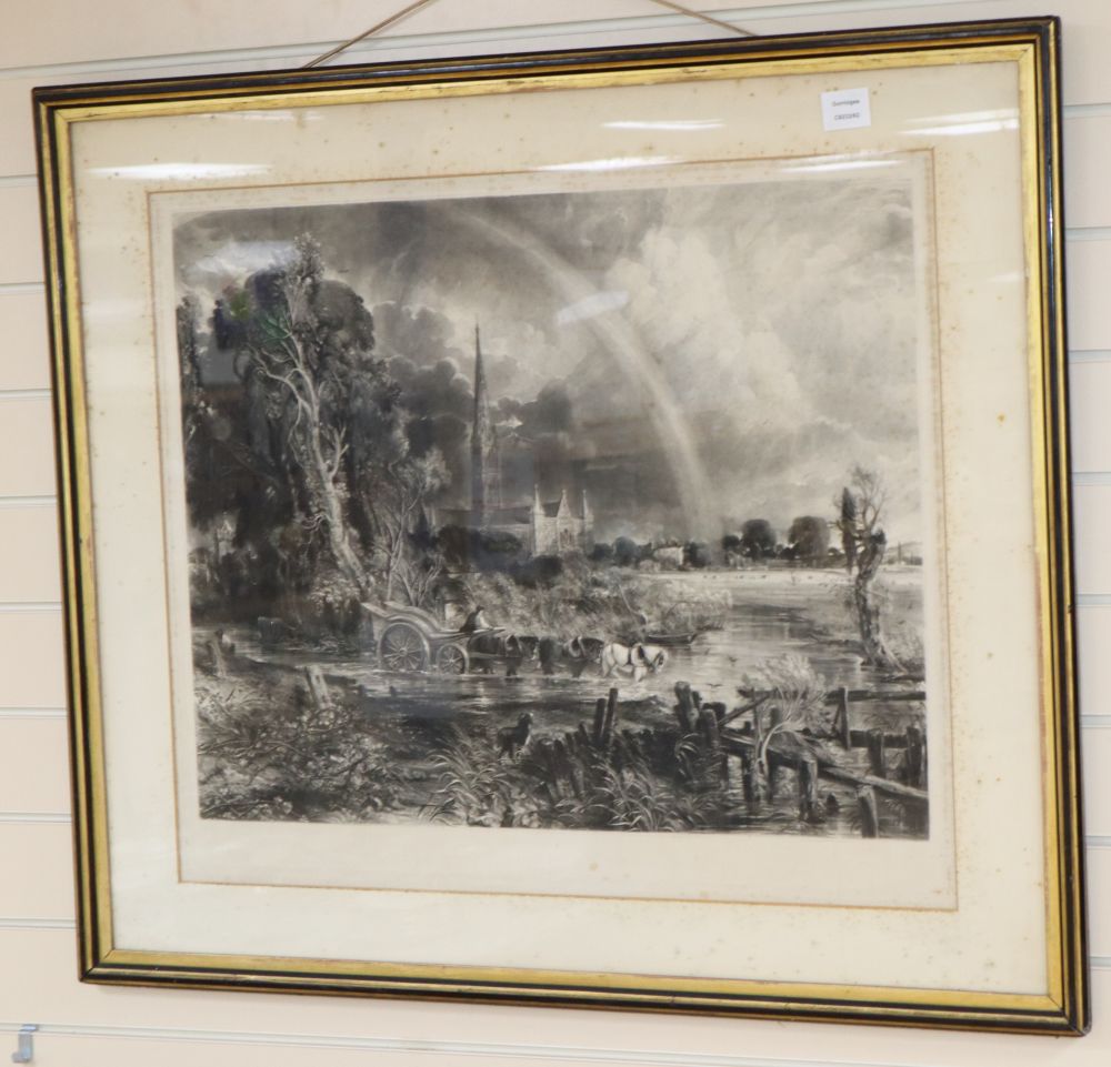
Although it is not clear on what basis the auctioneers claimed that it had been published in 1855. The description also said that it was ‘Heavily foxed throughout, very dirty.’ That was plainly true of the mat, but the print itself looked to be in reasonably good condition.
A further impression of this state was sold at Bonhams, Chester on 8 February 2010 as lot 745 with an impression of the Lucas plate of Dedham Vale, where the pair was bought for £432 incl premium by Mr Magdi Obeid, and offered by Hall’s Fine Art, in a timed online auction ending 17 October 2023 lot 85, fetching £230 (hammer) against an estimate of 60-80 GBP.
Finally, to round off the account of impressions during Constable’s lifetime, it would be most satisfactory to allow that the next, undated, letter is Constable’s last. If so, it shows that Lucas managed to supply Constable with a final proof on the Thursday:
Dear Lucas
The print is a noble and beautiful thing – entirely improved and entirely made perfect. The bow is noble, and is now a neck or northing business – it is startling and unique.
I have mentioned to your clever and agreeable ruffian [the printer] who is in high good humor, two things – the light on the tower under the trees must be made thus [sketch] instead of thus [sketch] – also the little spot on the cloud your ruffian will show you, and he pointed out a good way of doing it – half an hour will alter both.
Thank you for the pains you have taken with the bow – it is lovely.

Next: Poshumous proofs prior to 1848 edition
