
The Summerland, 1829
Mezzotint, printed in black ink on heavyweight, stiff, off-white [oatmeal], textured, wove rag paper
Image, 150 x 226 mm, on plate 175 x 251, on sheet cut to 215 x 290 mm
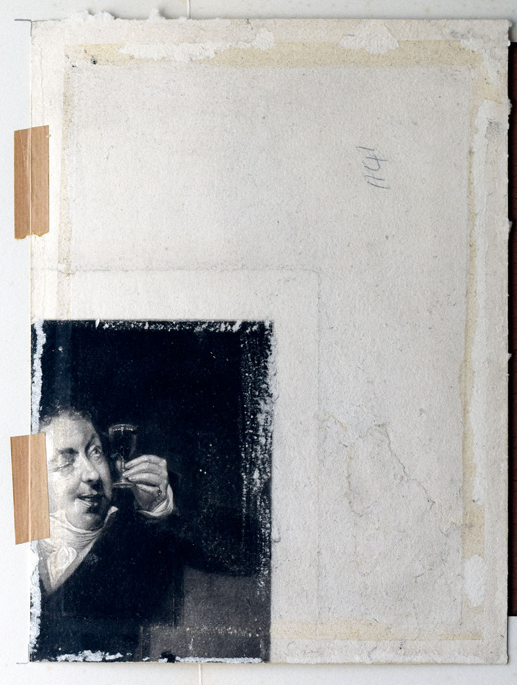
Inscribed in plate, lower right [indistinct] ‘1829 D Lucas’, and inscribed in graphite top right ‘3’, in centre of lower margin, partly trimmed, ‘7’, and on verso, towards right, ‘1141’.
To start with the first new ‘Summerland’ proof. At the sale on 27 June 2019 the catalogue identified this as state 10e as given in Andrew Shirley’s superb book Mezzotints by David Lucas after John Constable, published in 1930. This turns out to be wrong. It is, rather, the same state, a little more lightly inked, as an impression at the Fitzwilliam Museum, Cambridge, P139.1954. This I numbered (V) amongst the many variants of Shirley’s state d listed in the Sublimesites.co article ‘John Constable, David Lucas and ‘A Summerland’: Part #3 – The Progress Proofs [d]‘, which first appeared on 22 October 2018. I have now updated the original article to include reference to this new example.
The paper is robust and in fundamentally good condition. There is some faint mottling and spotting, but nothing at all obvious or distracting. The general brightness is perhaps somewhat diminished by surface dirt, but the original colour of the paper was oatmeal, and mellow-toned, even when new. There are patches on the verso where the original colour is well presented. The image itself is well-inked and richly toned. A crease in the paper extends vertically into the image from the top edge approx. 1/3 from the left.
With part of Henry Dawe’s mezzotint after Michael William Sharpe (1777-1840) entitled ‘The Bee’s Wing’, published 1 June 1824
The crease was present prior to printing, for it represents the plate line of an image on the verso. Lucas printed this proof onto the verso of a part sheet recycled from a (presumably discarded) impression of a mezzotint by Henry Dawe (1790-1848) of a painting by Michael William Sharpe (1777-1840) entitled ‘The Bee’s Wing’, published 1 June 1824.

The Bee’s Wing, 1824
Mezzotint, 261 x 211 mm, published 1 June 1824
Image courtesy of the Wellcome Collection
A man sits by a table and examines a full glass of wine that he holds to the light. Mezzotint by H. Dawe, c. 1824, after M. W. Sharp. Credit: Wellcome Collection. CC BY
The subject is an inebriated gentleman peering closely into a glass of wine. Quite what were the circumstances of Lucas using Dawes’s print in this way are unknown, but he appears to have quartered an impression and used other side of the top right corner to try an impression of ‘A Summerland’.
Dawe’s print is fine work in the mezzotint medium in which David Lucas was intending to make his reputation and would have been a fine example to study. Lucas’s principal interest, however, appears to have been in the paper. When one works through the series of ‘Summerland’ trial proofs it becomes apparent that Lucas and Constable tried a very wide variety of papers. There are hardly two the same. Some are much yellower, but most are more yielding to the pressure of the plate, giving a smooth finish to the surface of the print. In this case the paper is tough enough to have resisted the press. The plate impression is shallow, and there is still good texture to the surface within the plate margins. Constable seems to have been looking for a paper that would yield sufficiently to take maximum detail and sensitivity of tone, but stout enough to have character. It is worth observing that another example, [c (i) – the occasion of these articles] was trialled on an impracticably soft paper and that of another, near contemporary proof of ‘Willy Lott’s House’ (see above, to be discussed later) was trialled on a laid paper.
[Gallery]
This new impression compares most closely to two impressions at the Fitzwilliam Museum (P.139.1954 and P.140.1954). These are very close and quite difficult to separate, but the most obvious differences are that the highlights across the trees and hedgerow in the middle distance have been brightened, as has the white horse; the signature lower right is obscured, the cumulus clouds to the right have been smoothed and lightened and the top edge is indistinct in the latter.
Of the two, the new impression is closer, perhaps, to P.139.1954. It lacks the new highlights across the middle distance, and the brightened white horse. The sky indeed is perhaps less detailed, particularly in the principal crepuscular ray, and the dark cloud to the top right. In fact one might be inclined to suspect a slightly anterior position in the sequence, except for the fact that the new impression has the same indistinct top edge as P.140.1954.
It is possible that these relatively slight differences in detail between the new impression and P.139.1954 are insufficient to conclusively separate them out into different states. The apparent differences in the sky might be accounted for by variations in printing. In an entirely artisanal process such as this each impression is inked to a slightly different degree, there being so many variables, such as the dampness of the paper, the ambient temperature, the consistency of the ink, the pressure of the press. In any case it is clear that Lucas and Constable were here experimenting with different papers. P.139.1954 is printed on a stiff, heavy, off-white watercolour paper, the present example on a thick oatmeal wove, and P.140.1954 on a distinctly yellow, stiff watercolour paper. Of the three, my judgement would be that the colour is better in the first two, but the last takes the ink slightly more crisply, giving sharper, brighter lights.
TO BE CONTINUED

Many thanks for this fascinating update. An interesting perspective on how the two men worked together.
I note that Henry Dawe was the first engraver to work with Constable (http://collections.vam.ac.uk/item/O124394/leathes-water-or-wythburn-lake-print-dawe-henry-edward/) so one might imagine that Constable had had discussions with him on these matters, and had kept copies of his work which could be used in this way; also saving money on buying new paper. It is easy to forget (for me, anyway) that Lucas came somewhat late in the day in terms of Constable’s involvement with prints made from his work.
Kind regards
Michael Brewer
Dear Michael
Thank you for this observation. I confess that I hadn’t sufficiently registered this earlier connection between Dawe and Constable. I’m grateful to you for adding it to this account.
Even so, it feels like rough treatment of Dawe’s work, unless the ‘Bees Wing’ print was a reject; perhaps damaged in some way.
It does, however, suggest that Lucas and Constable felt that there was some ‘secret’ to Dawe’s work, perhaps associated with his choice of paper.
DH