This is the second of a series of articles in which I discuss a recently-discovered progress proof of the mezzotint of ‘A Summerland’ made by David Lucas for John Constable in 1829.

The Summerland, 1829
Mezzotint, printed in black ink on soft, thick, off-white laid rag paper
Image, 150 x 224 mm, on plate 177 x 251, on sheet 296 x 436
Inscribed in plate, lower right, ‘1829 D Lucas’, and inscribed in lower margin in graphite, ‘The Summerland’.
Private Collection
Photograph by David Hill
Here I begin a collation of the many stages through which the engraving evolved to publication. This might well strike many general readers as a rather elaborate game of ‘spot the difference’. There will be many images that look very similar. Worse still, they will all be in black and white. The discussion will at times be a little dry. Unless you are an academic, a dealer, a serious collector, or enjoy tedious detail, you might be best advised to wait for subsequent parts. These will explore the landscape itself, Constable’s development of the subject and its significance in his wider artistic achievement. There will eventually be colour again, and outdoor activity.
But these mezzotints are arguably some of Constable’s masterworks. Although they were actually made by a young engraver called David Lucas, Constable so closely directed his hand and so fretted about the prints’ aesthetic quality and detail, that they might easily be considered as autograph, and certainly as direct and authentic artistic output. As we shall see, Constable attended to the very finest details, and worried about achieving exactly the effects of handling and representation that he needed. That is why there are so many different states, and in working closely through the sequence we may follow exactly in his artistic footsteps. There is real treasure amongst all this dust, and it is worth a good deal of riddling to find it out.

Photograph by David Hill, taken 19 September 2018
The principal collections of proofs are to be found at the Fitzwilliam Museum, Cambridge, the British Museum, London, the Victoria and Albert Museum, London and the Metropolitan Museum of Art, New York. Many other museums hold individual examples or small groups, often amongst good collections of ‘English Landscape’ subjects. I have collated the major collections and noticed some of the other examples, but this list cannot pretend to be definitive. It seems obvious that there must be other impressions to be noticed, and perhaps wholly new states to be listed.

Hon Andrew Shirley’s, ‘The Published Mezzotints of David Lucas after John Constable’, Oxford, 1930 still remains the most complete collation of all the progress proofs.

Shirley’s account of the published states has been superseded by Osbert H Barnard’s ‘Lucas-Constable: English Landscape, Revised List of States’, published in Print Quarterly, Vol.1, No.2 (June 1984), pp.120-123, but it is the progress proofs with which I am here concerned, and Barnard excludes those. Using the definition of a material alteration to the plate, I have been able to add a considerable number of states to Shirley’s list. However, since my list will no doubt be superseded in its turn, and because Shirley’s order remains sound, I have decided not to attempt to impose a new numeration. Instead I take Shirley’s alphabetic taxonomy and simply add a subnumeration, but only for substantive material changes in the plate. The same plate can print quite differently on different papers, or with different inks, or by the plate being wiped differently, or depending on an infinite variety of ambient factors. I note any such variations as we go along. I’m happy to leave a completely new numeration to a future scholar who might be confident that such a scheme will usefully subsist.
THE PROGRESS PROOFS:
Shirley state a:
Shirley’s 1930 catalogue under no.10 identifies the earliest-known state as: ‘a 5 15/16 x 8 7/8. Bottom margin not cleaned. The clouds only lightly grounded and not much developed; a faint rainbow in the sky. The plain broadly treated, before many lights there and before most work on trees and hedge r., and distance r. The signature in r. bottom corner indistinct. Inscribed by Lucas ‘2 thi[s] state 2’. –Brit Mus.’
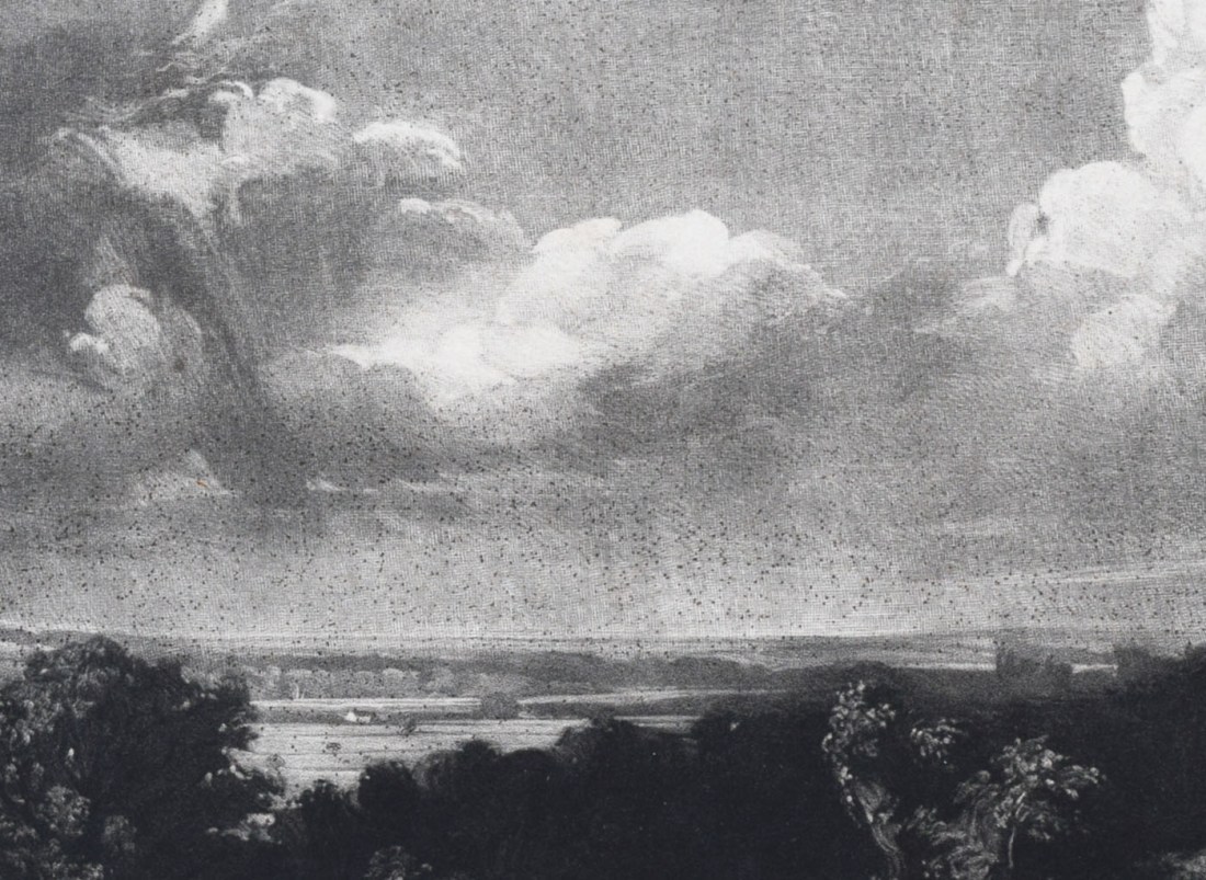
A Summerland, 1829
Mezzotint, printed in black ink on paper
Image, 150 x 224 mm, on plate 177 x 251
British Museum, London, (1842.1210.102)
Image courtesy of the British Museum and ©Trustees of the British Museum
Shirley does not give the exact reference, but by a process of elimination this can be identified as British Museum 1842.1210.102. This was bought by the British Museum in 1842 from James Baker Pulham, who, with his father James Pelham of Woodbridge Suffolk, was a friend and patron of Constable.
Shirley was researching in the late 1920s when photography was a rather different business than today. It was possible for professional photographers to produce excellent prints, but to resolve the finest detail of images such as these – whose grain is positively microscopic, and whose subtlety of tonal level and nuance is the very substance of their artistic excellence – was impossible. It is a serious challenge even for modern digital technology whose resolution, tonal range and control could not have been imagined in the 1920s. Suffice it to say that when Shirley did work from photographs [and there is no other way that he could have compared states, except across the holdings of individual collections] then his ability to gauge detail and tone would have been seriously compromised. It seems plain that his description of the BM impression: ‘clouds only lightly grounded and not much developed’ is only relatively true. In later states of the image, Constable, the Shakespeare of skies, drove Lucas to produce one of the most magnificently complex and high-wrought cloudscapes of the entire history of art, and one of the artist’s and the engraver’s masterpieces. Even here, however, we see a highly resolved and tonally rich production, almost Rubensian in character. Nevertheless, as we shall see, it was not enough for Constable.
Shirley also says that ‘The plain broadly treated, before many lights there and before most work on trees and hedge r., and distance r. ‘ This is unrepresentative of how much has already been achieved: There is indeed a lot of new work to come in later states, but there is already a good deal of work resolved in the plain, and whilst later states show improvements and revisions to the mid-distance areas and the hedge, much of the key detail and form in both is already present.
Shirley records that the BM impression is inscribed by David Lucas ‘2 thi[s] state 2’. The implication of this appears to be that only two impressions were pulled of this state, and additionally, perhaps that this was actually the second state. It seems unlikely that the plate would have progressed as far as this without at least one earlier proof to check its progress.
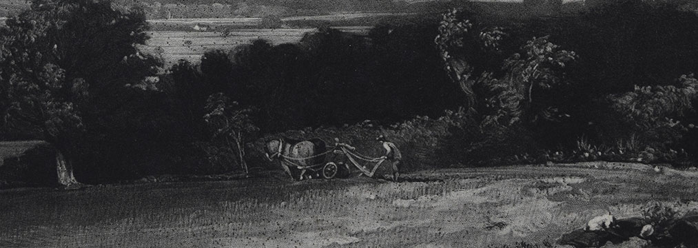
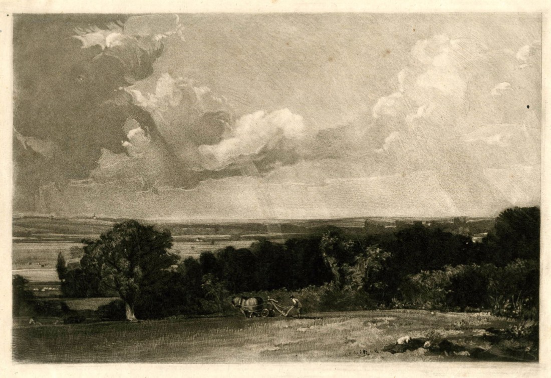
Shirley state (b)
Shirley’s second state is ‘b Same size. Bottom margin not clean. Still with light ground and rainbow in the sky. The plain bright, and three cows added l. of l. tree. The hedge r. scraped a little but the trees behind still black and the distance not developed. A sapling just visible by the plough. The signature indistinct. Inscribed ‘only state’. – Cambridge.’
Mezzotint, printed in black ink on paper Image, 150 x 224 mm, on plate 177 x 251
Fitzwilliam Museum, Cambridge, P1381-R,
Image taken by David Hill, and reproduced by courtesy of the Fitzwilliam Museum
This can be identified with the Fitzwilliam Museum impression P.1381-R, which was presented to the Museum in 1910 along with a stellar collection of ‘English Landscape Scenery’ proofs that were in the collection of H S Theobald sold at Christie’s in April 1910 (where this lot 1090). These appear to have been from David Lucas’s own collection, descended to Alfred Lucas.
There are various inscriptions: At the lower left in ink, ‘only state N3’; in the left lower margin in pencil, ‘only state’; and in the lower right corner in pencil, ‘(1)’. The latter indicates its position in a sequence, probably of states, though by whom is unclear – but see below under Fitzwilliam Shirley state (c). Finally, the print is also inscribed under the centre of the lower plate line in pencil, ‘233’, which is probably its number in Theobald’s collection. The inscription leaves no doubt that this is certainly to be identified as Shirley’s state ‘b’.
Detail of lower left corner.
Shirley state (a). The stream is shortened, and the ploughman made brighter in state b.
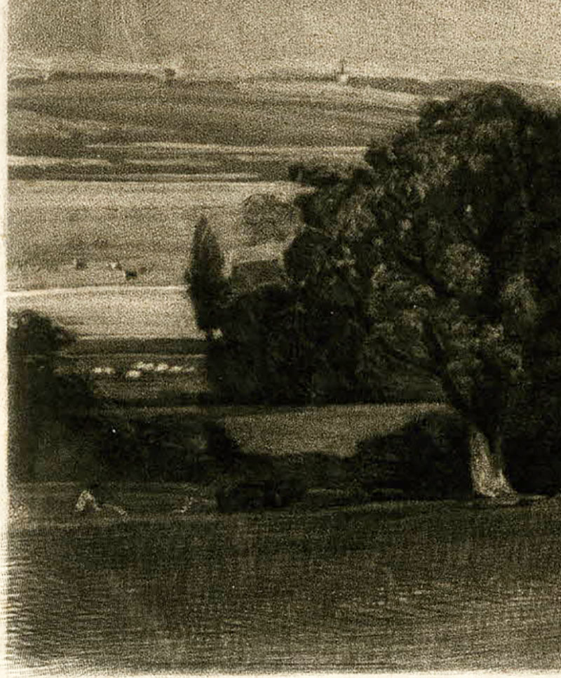
In terms of some of the specific details that he mentions Shirley seems to be in error. He says of the Fitzwilliam impression that ‘three cows added l. of l. tree’, but these are also present in the BM impression and are unchanged here. There is, however, one material difference in this area. The stream below the cows, which is shown as a complete light line in the BM impression is here textured out except at the far left. Below that, the small ploughman prints much more clearly, and might have been lightened. There is also a white scratch or slipped stroke that descends from the left part of the white sheep, above, to the right part of the plough. This stroke is faintly visible in the BM impression, and persist in proofs of later states. Also in this same area is another change. Above right of the white sheep is a poplar tree and to the right of that the roof of a house. Two new white marks occur in the foliage to the right of the roof, and these persist in later states.
Shirley also says ‘The hedge r. scraped a little but the trees behind still black and the distance not developed’. The most obvious differences are the sprinkling of new lights across the central band of trees and hedgerow. The light of a building just below the horizon towards the right has been heightened but the distance in these areas in both cases is already almost fully developed.
Detail of centre
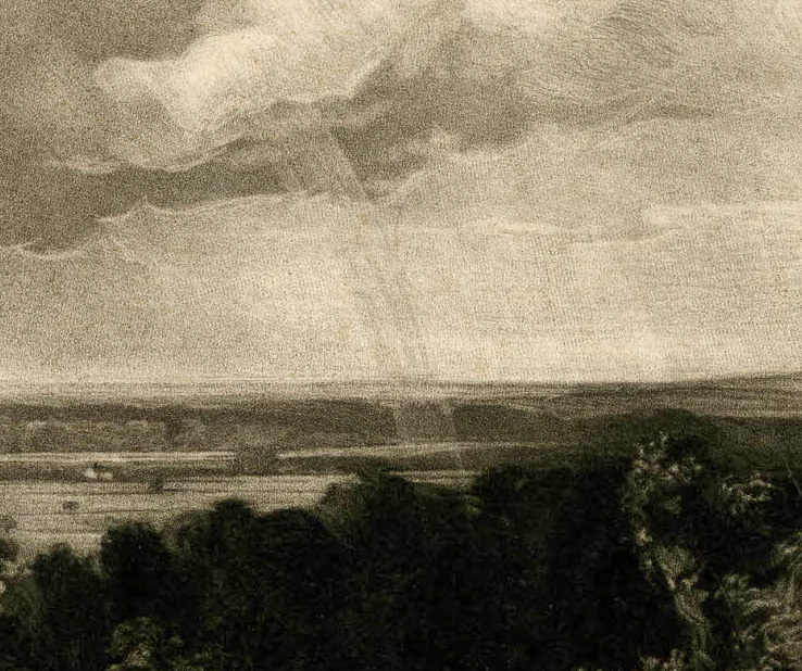
Shirley state (a). This seems plainly intended to be a rainbow, but the effect is reworked in state (b) to make that less obvious.
One significant difference is the reworking of the central light. In the British Museum impression, it looks very much as if it was intended to be a rainbow. This might well be a Rubensian touch, but, as Constable would have well known, completely impossible. It looks possible that it was a misinterpretation by Lucas of some feature in the original painting. Either way, this area has been reworked. The light in the sky has been rendered light against a darker toned background, and the continuation of the light below the horizon has been diminished. Shirley is surely wrong to continue to see it here as a rainbow. The intended reading now seems to be of a crepuscular ray in the far distance. It might be admitted that it is not totally successful. The rays require straightening to be entirely convincing; as it is, they still follow the curve of the original bow.
Finally Shirley says: ‘A sapling just visible by the plough’, and whilst this will come into greater prominence in later states, it is equally present and visible in the British Museum and Fitzwilliam impressions, albeit except for perhaps a new highlight stroke on the trunk of the Fitzwilliam impression.
The upper right margin seems to have been cleaned up for the Fitzwilliam impression, and the BM impression has two tiny vertical strokes on the upper keyline towards the right.
‘The ‘only state’ inscription on the Fitzwilliam impression might be taken to mean that this was the only proof pulled of this state. In passing it might be noted that the ‘N3’ of the inscription might be a date, November 3.
b (i)
At this point Constable instructed Lucas to comprehensively rework the sky. The first explicit reference to this is in a letter of 26 February 1830. ‘I have taken much pains with the last proof of ‘The Summerland’, but I fear I shall be obliged to reject it – it has never recovered from its first trip up, and the sky with the new ground is and ever will be as rotten as cow dung’.
This begs some explanation. The new sky eventually became magnificent, and as represented in Shirley’s next state, (c) is already rather good. The first ‘trip up’ appears to have been that in states (a) and (b) lacked tonal depth and impact. It is quite faint in state (b) and, as we shall see, in Shirley’ state ‘c’ much enriched. We will also consider the phrase ‘Rotten as cow dung’ under state (c).
Mezzotint, printed in black ink on paper Image, 150 x 224 mm, on plate 177 x 251
Fitzwilliam Museum, Cambridge, P138.1954
Image taken by David Hill, and reproduced by courtesy of the Fitzwilliam Museum
Before we reach that point we must first consider an impression at the Fitzwilliam Museum (P138.1954) that he did not know. This represents the first reworking of the sky as mentioned by Constable in the letter above. It injects tone and contrast to a quite outlandish extent, and quite sufficiently to explain Constable’s subsequent anxieties about the image. The Fitzwilliam online catalogue lists this as Shirley state c (II), but the work on the plate is plainly anterior to (c), so is here numbered as b (i).
The foreground and most of the middle distance towards the horizon is exactly as in state (b), (Fitzwilliam Museum P1381-R) but the sky has been subject to an almost manic rework. The manner of this, however is almost perfectly in keeping with Constable’s own later oil sketches, and it seems perfectly possible that Lucas was following the artist’s instructions. It might further be observed that the boisterous handling is very similar to that of a large plate of ‘Hadleigh Castle’, on which Lucas was working contemporaneously.
In the process of the rework the light church on the horizon towards the left has been effaced. This is eventually reinstated, but is a good marker for the order of subsequent states.
Shirley state (c)
Mezzotint, printed in black ink on paper Image, 150 x 224 mm, on plate 177 x 251
Fitzwilliam Museum, Cambridge, P1382-R
Image taken by David Hill, and reproduced by courtesy of the Fitzwilliam Museum
Shirley’s state (c) is an impression at the Fitzwilliam Museum that may be identified as (P.1382-R).
In this, the foreground up to the horizon is unchanged from state b (i) (Fitzwilliam Museum P.138.1954), and indeed from state (b) (Fitzwilliam Museum P1381-R) but the rough reworking of the sky has been greatly ameliorated and resolved. In general the rough darks have been eliminated, the lights smoothed, the tonal transitions rendered less abrupt, the horizon lightened and redefined, and the curtains of rain in the distance rendered more subtle and sensitive. Some cirrus clouds have been added at the top right.
In truth, the result is not that dissimilar to state (b), except in so far as the whole sky has more tonal presence. The effect is most emphatic in the right half, and the whole patch of open sky in the centre has greater presence. The result of the reworking, however, is that the whole sky, but most noticeably amongst the curtains of rain above the horizon, and in the upper parts, has acquired much more texture than it had in states (a) and (b). The Fitzwilliam impression is lighter toned than that at the British Museum, but in both the lights have greater degree of transparency. It must have been this characteristic that so agitated Constable, and although ‘rotten as cow dung’ seems an over-reaction, it is undeniable that in some places the sky now has a quality rather more material than ethereal.
The word ‘rotten’ suggests an almost atavistic feeling of revulsion. Constable returned to the theme slightly later in the letters when on 2 March 1830 [Beckett p.326 he told Lucas: ‘Take care to avoid rottenness, it is the worst quality of all.’ So what did Constable mean, and why was the feeling so strongly held?
Anyone who has ever painted will understand the problem. Without firm technique it is all too easy for a work to collapse into a mess. When this happens it can seem as if our highest hopes and finest intentions had turned corrupt and diseased. Most artists work in fear of such horror, and safeguarded only the most rigorous effort, planning and technique. But when things go awry, the work becomes as repugnant as ordure. It is as if the making of art is the most primordial of struggles; to construct something fine in an environment that wants to corrupt everything into excrement. The remainder of this story is of Constable’s success in keeping this image out of the mire, and eventually lifting it into the light.
The Fitzwilliam impression is inscribed in ink at the lower left corner of the sheet ‘2 in this state N5’. Shirley identifies the hand as David Lucas. It is certainly the same hand as in the Fitzwilliam’s state (b) (P1381-R), but presents some problems of interpretation. The final N5 might be taken as a date, November 5th, except for the fact that state (b) is inscribed ‘N3’, which would leave only two days for the sky to have been regrounded as in state b (i) and reworked as here. This is not impossible – Lucas is known to have stayed up all night working on a plate.
The inscription clearly states that there were only two impressions taken of this state. At least three more similar impressions are known; one mentioned by Shirley under his State (c) as in the collection of Victor Rienaecker and two more at the V&A (E821/822.2016). Neither of the V&A impressions seem to have been known to Shirley.

A Summerland, 1829
Mezzotint, printed in black ink on paper
Image, 150 x 224 mm, on plate 177 x 251
Metropolitan Museum of Art, New York (39.68.13)
Image courtesy of the Metropolitan Museum of Art.
First of all, however, the impression mentioned by Shirley as in the Rienaecker collection is now in the Metropolitan Museum, New York (39.68.13), having been sold by Rienaecker through Colnaghi in 1939 and bought by the museum through the Harris Brisbane Dick Fund. Shirley notes that this impression is ‘inscribed in an unknown hand; ‘Only one, before the new ground for the sky’. The note appears mistaken on all counts. It follows the regrounding of the sky, and is one of several impressions representing the same state.
A Summerland, 1829
Mezzotint, printed in black ink on paper
Image, 150 x 224 mm, on plate 177 x 251
Victoria & Albert Museum, London, 821.2016
Image courtesy of Victoria and Albert Museum

A Summerland, 1829
Mezzotint, printed in black ink on paper
Image, 150 x 224 mm, on plate 177 x 251
Victoria & Albert Museum, London, 822.2016
Image courtesy of Victoria and Albert Museum
The two plates at the V&A 821/822.2016 appear to be identical to both the Fitzwilliam Museum P1382-R and the Metropolitan Museum impressions and we can comfortably assign all these to the same state number (c). This also leaves the Lucas inscription on the Fitzwilliam impression that there were ‘2 in this state’ in evident error. It might be that sharper eyes than mine will be able to distinguish further between them.
c (i)
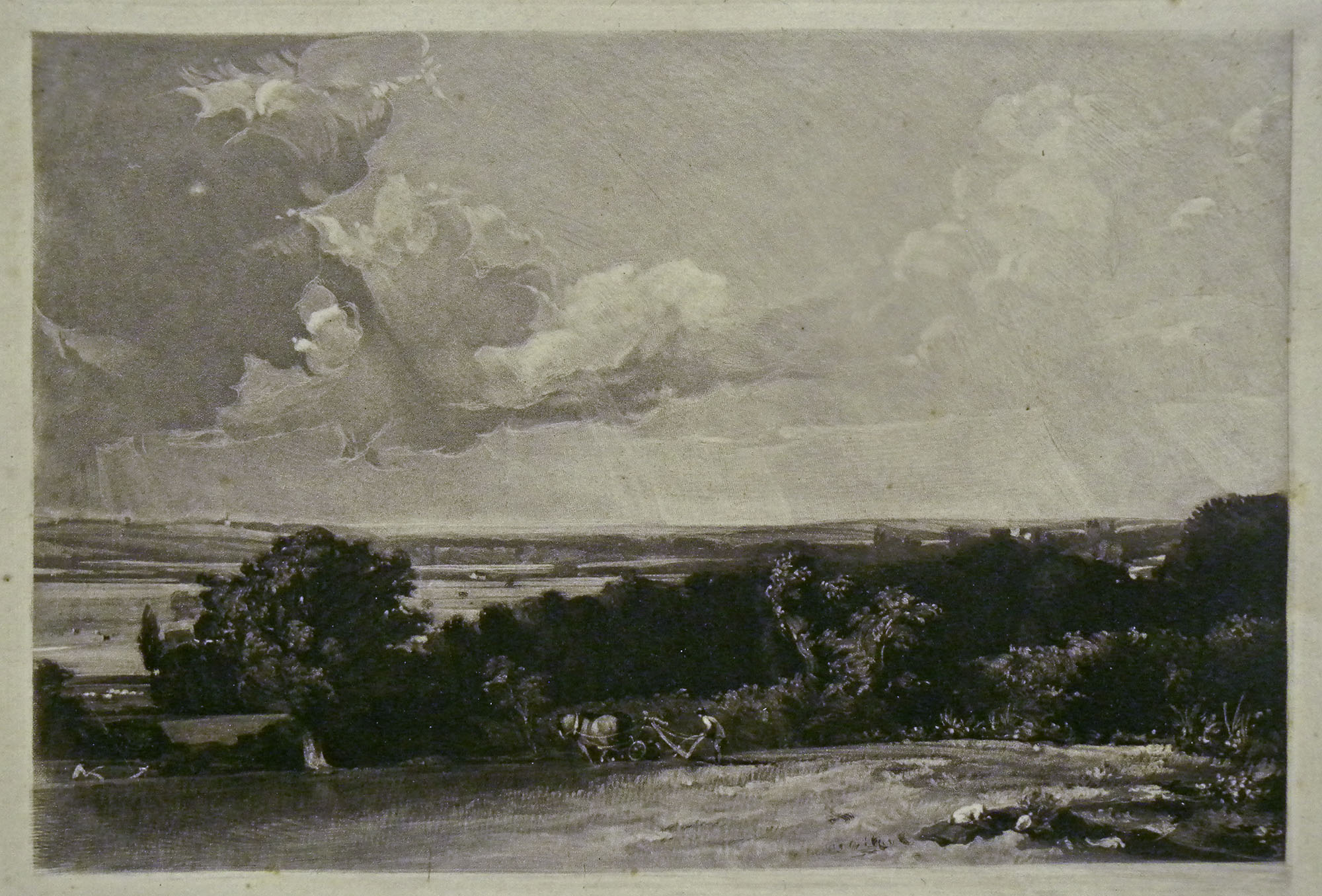
The Summerland, 1829
Mezzotint, printed in black ink on soft, thick, off-white laid rag paper
Image, 150 x 224 mm, on plate 177 x 251, on sheet 296 x 436
Inscribed in plate, lower right, ‘1829 D Lucas’, and inscribed in lower margin in graphite, ‘The Summerland’.
Private Collection
Photograph by David Hill
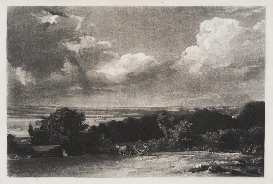
The newly-discovered impression that provides the occasion for this artcle is artistically identical to the impressions belonging to State (c). I can find no material differences between the images per se. The crucial difference, however, is in the bottom right-hand corner of the plate, where one can now, and for the first time, clearly read the inscription: ‘D Lucas 1829’.

Lucas has obviously visited this area with the drypoint and made out the inscription. Looking back at earlier states, however, it is tempting to see indications of a nascent inscription right from the beginning. Shirley felt so too, and his account of the various states constantly finds signs of it, but not quite resolved. Of his state (a) he says ‘The signature in the r.bottom corner indistinct.’ Of his state (b) he says ‘The signature indistinct’, and of state (c) ‘Signature still indistinct’. Only of his state (d) as we shall see, does he say ‘Signature distinct’. Of his next state ‘e’ he says that it is again indistinct, and it remains thus thereafter. So only in the present state (c) and those to be identified with Shirley state (d) does the signature appear at all clearly. If it were not for the signature as it appears here, one might not see it at all in the earlier impressions. Lucas appears to attempting to smuggle it into the composition. Given its short life-span in the states, one might surmise that Constable objected. The image, after all, belonged entirely to the artist.
So far as I know this is the only impression of Shirley state (c) in which the signature is so crisply made out. It does, however, remain equally clear in various impressions of Shirley state (d)
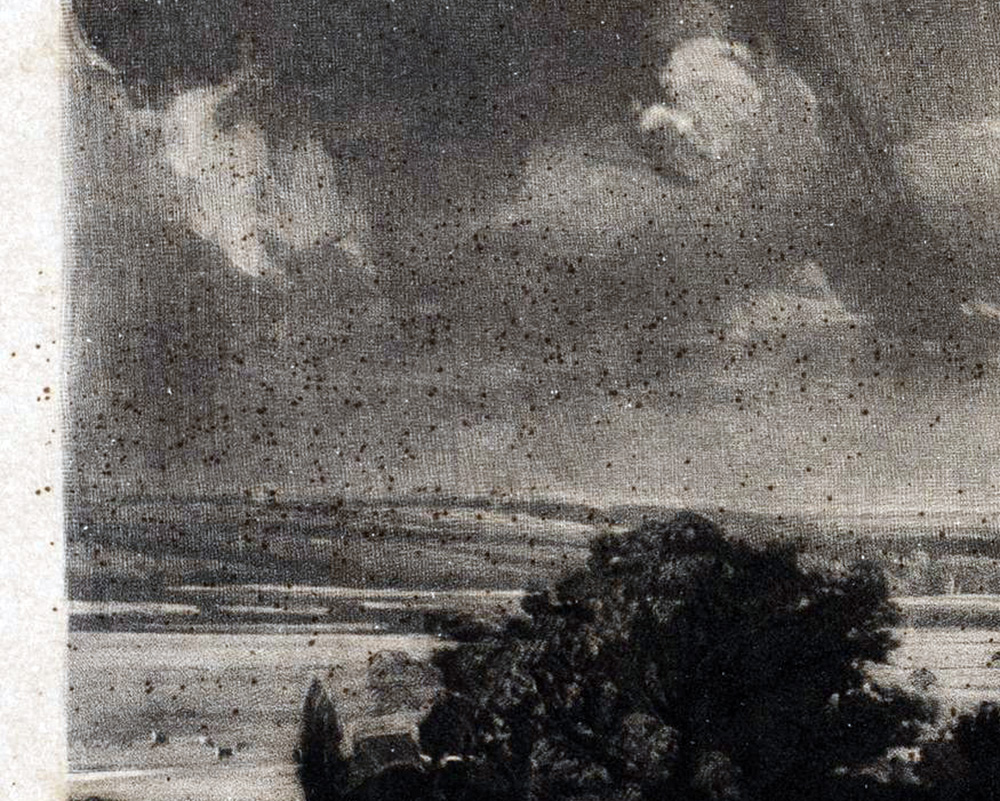
Detail of left side and margin showing brown spots.

Detail of left side and margin showing brown spots.
One peculiarity worth noting here is that this impression is spattered with small brown droplets. These occur only within the plate margin so must have settled on the plate between wiping and printing. The V&A’s impression 822.2016 is similarly marked, although the distribution is not exactly contiguous. It is unclear what might be the explanation for this.

The newly-discovered impression is also distinguished by being inscribed in graphite in the lower margin with its title ‘The Summerland’. Comparison with the same word where it occurs in the Lucas/Constable correspondence at the Fitzwilliam Museum suggests that the inscription might be by Constable himself.

Fitzwilliam letters of ?summer 1830 (Shirley number 23; Beckett p.334)
Photograph by David Hill, reproduced by courtesy of the Fitzwilliam Museum
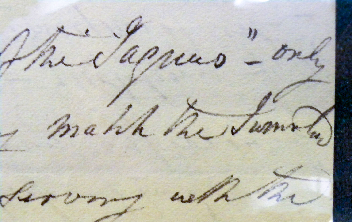
Fitzwilliam letter 7 October 1832 (Shirley 120; Beckett pp. 382-3).
Photograph by David Hill, reproduced by courtesy of the Fitzwilliam Museum
There is always a slight separation of the two ‘m’s and another between ‘Summer’ and ‘land’, even when the ‘l’ of land is lower case. Across the instances the treatment of ‘Summerlan’ is completely consistent with the title here. The only variation is in the final ‘d’, which, whilst of the same general form, usually has a final horizontal flourish to the right. There are two instances in the correspondence, however, where it is identical to that here – in letters of ?summer 1830 (Shirley number 23; Beckett p.334) and 7 October 1832 (Shirley 120; Beckett pp. 382-3). Altogether, and especially given the orthographic idiosyncrasies, the comparison appears convincing.
TO BE CONTINUED

